
Flows & Liquidity
Watch the US FRIs
- We use our Forecast Revision Indices (FRIs) to provide a framework on how US economic surprises under a second Trump presidency would impact markets.
- We continue to see room for the Trump trade to reverberate over the coming eight weeks or so in a similar fashion to 2016.
- Gold and bitcoin should both benefit from a second Trump presidency. Bitcoin to get an extra boost from MicroStrategy’s massive bitcoin purchase program.
- The recent sharp narrowing of swap spreads in both the US and Europe is a reminder of the rising “inconvenience” of government bonds.
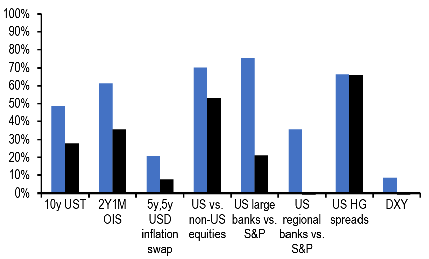
- We have been arguing over the previous weeks that from both price and position point of view, markets had not embedded high probability of a Trump win, with perhaps the exception of credit markets. Figure 1 suggests that this is still largely true after today’s initial market reaction, even as there has been some further pricing in of a Trump win relative to a week ago. In turn, this suggests that over the coming weeks the so called Trump trade has room to further reverberate in markets by raising US bond yields, by boosting the dollar, by boosting US equities and in particular US regional banks and small caps and by lowering US credit spreads. As a reminder to our readers to derive the implied probabilities of Figure 1 we envisage the Trump trade in a similar fashion to 2016 when the Trump trade had reverberated over a period of around eight weeks. For the current juncture, we choose the market moves since August 1st as the starting point of the Trump trade to avoid the market swings/recession fears that had followed the weak US payroll report of August 2nd (these recession fears were subsequently unwound during September/October).
- In other words, despite today’s rather muted market reaction to the election result on some asset classes, we continue to see room for shorts to be covered and for positions to be unwound further across equities, rates, fx and credit (see F&L of October 30th 2024) as the Trump win reverberates over the coming eight weeks or so in a similar fashion to 2016.
Figure 1: Implied probability of a Republican sweep from various asset classes as of Nov 6th
In %. Moves from Aug 1st to Nov 6th. Black bars indicate changes upto 29th Oct.
Source: Bloomberg Finance L.P., J.P. Morgan.
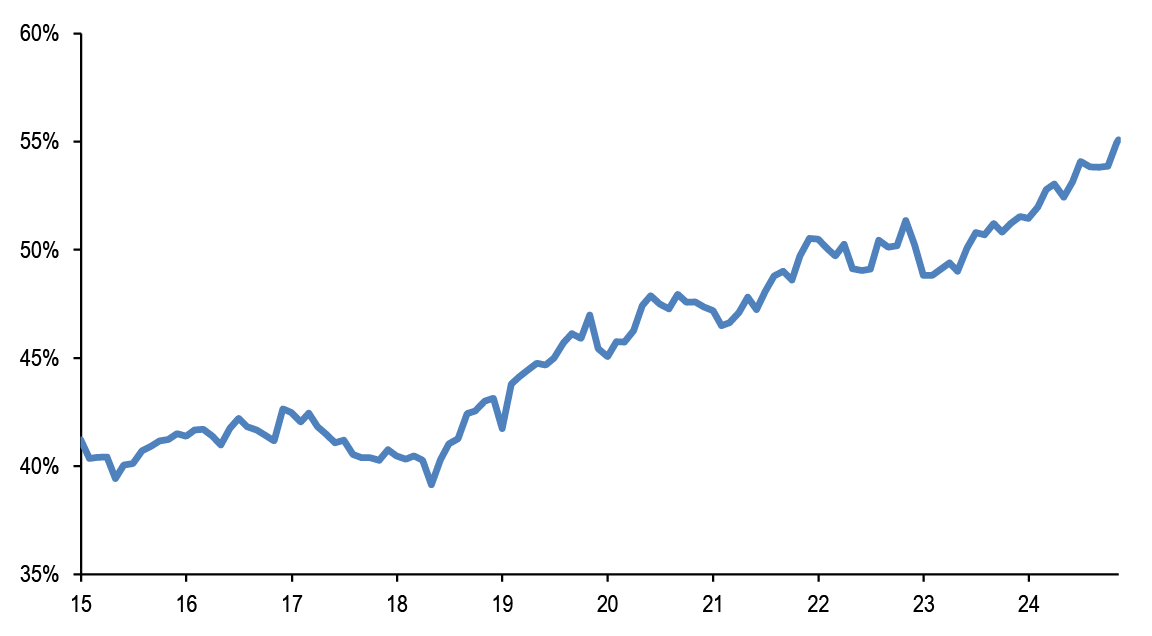
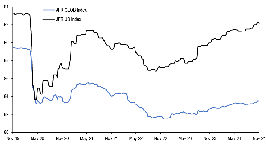
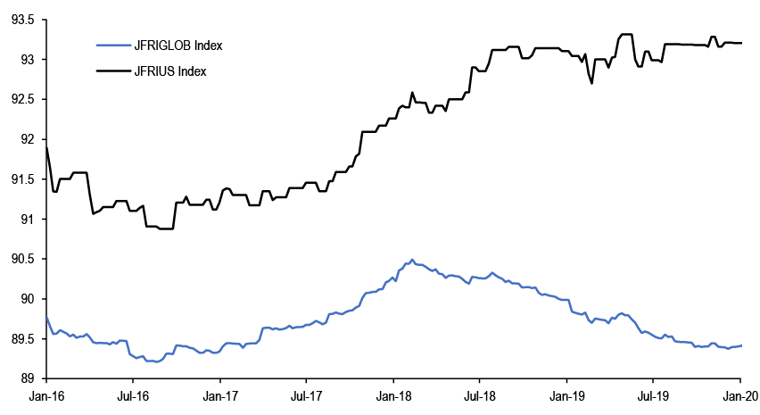
- Outside the reverberations over the coming weeks, over the longer term the Trump win is likely to reinforce the so called US exceptionalism. We argued previously that US exceptionalism has two main manifestations: the dominant position of US equities and the outperformance of the US economy. The first has been reflected in the rising share of US equities in global equity markets ( Figure 2). The latter has been reflected in the striking divergence between economic growth surprises in the US vs. the rest of the world. This is shown by Figure 3 which depicts our Forecast Revision Index (FRI) for US GDP vs Global GDP. This US economic outperformance had also been a feature in the first Trump presidency when tariffs hit during 2028/2019 ( Figure 4). With US tariffs potentially hitting the rest of the world earlier in the second Trump presidency, perhaps as soon as early next year, the current US economic outperformance could spill over into 2025. In turn this raises the question: how would US economic surprises impact markets?
Figure 2: Share of US in global equities by market value
Based on DataStream equity indices.
Source: LSEG DataStream J.P. Morgan.
Figure 3: Forecast Revision Indices for US and Global GDP over the past five years
The J.P.Morgan Forecast Revision Index (JFRI) is shows the cumulative change in the J.P.Morgan Forecast History Index (JFRI) starting at 100 in 4 January 2002. In this regard, the change in any given week shows the %-point revision to the J.P. Morgan economic research forecast of average real GDP growth over the quarters t-1, t, t+1, and t+2, where t is the quarter in which the forecast is made. See description for the JFHI for more details.For further documentation, see ‘Know thyself: Evaluating and using J.P. Morgan economic forecasts’, Joseph Lupton et al, J.P. Morgan, Global Issues, 23 September 2014.
Source: Bloomberg Finance L.P., J.P. Morgan.
Figure 4: Forecast Revision Indices for US and Global GDP during the first Trump presidency
The J.P.Morgan Forecast Revision Index (JFRI) is shows the cumulative change in the J.P.Morgan Forecast History Index (JFRI) starting at 100 in 4 January 2002. In this regard, the change in any given week shows the %-point revision to the J.P. Morgan economic research forecast of average real GDP growth over the quarters t-1, t, t+1, and t+2, where t is the quarter in which the forecast is made. See description for the JFHI for more details.For further documentation, see ‘Know thyself: Evaluating and using J.P. Morgan economic forecasts’, Joseph Lupton et al, J.P. Morgan, Global Issues, 23 September 2014.
Source: Bloomberg Finance L.P., J.P. Morgan.
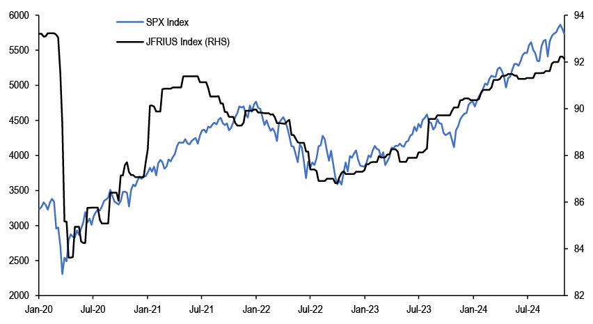
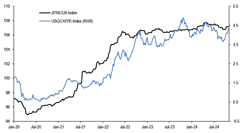
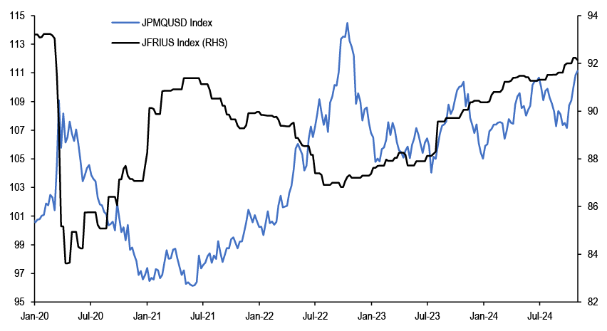
- To answer this question we look at the experience over the past five years which in our opinion sheds some light on the relationship between US economic surprises and markets. The S&P500 index has been tracking our US FRI rather closely as shown in Figure 5. As a result to the extent the Trump win sustains the upward trajectory in US economic growth surprises, the bull equity market would continue. This is also true with US credit. The US HG corporate credit spread has been tracking our US FRI rather closely as shown in Figure 6. Again to the extent the Trump win sustains the upward trajectory in US economic growth surprises, US credit spreads would tighten further. Higher US economic surprises should in principle lead to higher UST yields. However, for UST yields we find a closer relationship with US inflation surprises (i.e. our US CPI FRI) than US growth surprises (i.e. our US GDP FRI). This is shown in Figure 7. In other words, to the extent that the Trump win resumes the upward trajectory in US CPI surprises, UST yields would have further upside. The relationship between US economic surprises and the dollar has been more complicated. US economic surprises have most of the time exhibited negative correlation with the dollar, i.e. the dollar tended to weaken when US economic surprises were rising and vice versa. This mostly negative correlation is shown in Figure 8. This also happened during the first year of the first Trump presidency, i.e. during 2017, when then dollar weakened as US economic surprises increased as shown in Figure 9. But Figure 9 also reveals that this negative correlation reversed sign during the tariff years of 2018/2019 i.e. when US tariffs hit the world, the US dollar appreciated (to largely offset US tariffs) in tandem with rising US economic surprises. And this 2018/2019 positive correlation backdrop between US economic surprises and the dollar is likely to be repeated into 2025 if universal US tariffs are introduced by the Trump administration early next year.
Figure 5: Forecast Revision Index for US GDP vs the S&P500 index
The J.P.Morgan Forecast Revision Index (JFRI) is shows the cumulative change in the J.P.Morgan Forecast History Index (JFRI) starting at 100 in 4 January 2002. In this regard, the change in any given week shows the %-point revision to the J.P. Morgan economic research forecast of average real GDP growth over the quarters t-1, t, t+1, and t+2, where t is the quarter in which the forecast is made. See description for the JFHI for more details.For further documentation, see ‘Know thyself: Evaluating and using J.P. Morgan economic forecasts’, Joseph Lupton et al, J.P. Morgan, Global Issues, 23 September 2014.
Source: Bloomberg Finance L.P., J.P. Morgan.
Figure 6: Forecast Revision Index for US GDP vs the US HG corporate credit spread
The J.P.Morgan Forecast Revision Index (JFRI) is shows the cumulative change in the J.P.Morgan Forecast History Index (JFRI) starting at 100 in 4 January 2002. In this regard, the change in any given week shows the %-point revision to the J.P. Morgan economic research forecast of average real GDP growth over the quarters t-1, t, t+1, and t+2, where t is the quarter in which the forecast is made. See description for the JFHI for more details.For further documentation, see ‘Know thyself: Evaluating and using J.P. Morgan economic forecasts’, Joseph Lupton et al, J.P. Morgan, Global Issues, 23 September 2014.

Source: Bloomberg Finance L.P., J.P. Morgan.
Figure 7: Forecast Revision Index for US CPI vs the 10y UST yield
The J.P. Morgan CPI Forecast Revision Index (JFRIC) shows the cumulative change in the J.P. Morgan CPI Forecast History Index (JFRIC) starting at 8 June 2012. In this regard, the change in any given week shows the %-point revision to the J.P. Morgan economic research forecast of CPI inflation %oya over the quarters t-1, t, t+1 and t+2 where t is the quarter in which the foredxycast is made. For further documentation see ‘Know thyself: JPM Inflation Forecast Revision Index’, Global Issues, 2 August 2018.
Source: Bloomberg Finance L.P., J.P. Morgan.
Figure 8: Forecast Revision Index for US GDP vs the US dollar over the past five years
The J.P.Morgan Forecast Revision Index (JFRI) is shows the cumulative change in the J.P.Morgan Forecast History Index (JFRI) starting at 100 in 4 January 2002. In this regard, the change in any given week shows the %-point revision to the J.P. Morgan economic research forecast of average real GDP growth over the quarters t-1, t, t+1, and t+2, where t is the quarter in which the forecast is made. See description for the JFHI for more details.For further documentation, see ‘Know thyself: Evaluating and using J.P. Morgan economic forecasts’, Joseph Lupton et al, J.P. Morgan, Global Issues, 23 September 2014.
Source: Bloomberg Finance L.P., J.P. Morgan.
Figure 9: Forecast Revision Index for US GDP vs the US dollar during the first Trump presidency
The J.P.Morgan Forecast Revision Index (JFRI) is shows the cumulative change in the J.P.Morgan Forecast History Index (JFRI) starting at 100 in 4 January 2002. In this regard, the change in any given week shows the %-point revision to the J.P. Morgan economic research forecast of average real GDP growth over the quarters t-1, t, t+1, and t+2, where t is the quarter in which the forecast is made. See description for the JFHI for more details.For further documentation, see ‘Know thyself: Evaluating and using J.P. Morgan economic forecasts’, Joseph Lupton et al, J.P. Morgan, Global Issues, 23 September 2014.

Source: Bloomberg Finance L.P., J.P. Morgan.
- Can we use the US FRIs of Figure 5 to Figure 9 to derive profitable systematic trading rules? The answer is yes to a significant extent. Using a positive sign in the 13-week change in the US GDP FRI to go long US equities vs cash, US vs non US equities, US HG corporates bonds vs USTs (and to go short if the sign of the US GDP FRI is negative) produced a Sharpe ratio of 0.50, -0.13 and 0.28 respectively over the past decade ( Figure 10). In other words, while the 13-week change in the US GDP FRI has been useful for trading US equities and credit, it has been less useful for trading US vs non-US equities.
Figure 10: Sharpe Ratios for using our US GDP and US CPI Forecast Revision Indices (FRIs) to trade various assets classes
See text for details about the exact trading rules
| US equities | US - non US equties | USTs | 10y USTs | US HG credit | DXY | JPM Dollar Index | EM FX | |
| Sharpe Ratio | 0.50 | -0.13 | 0.45 | 0.36 | 0.28 | 0.29 | 0.43 | 0.34 |
| Annual return | 8.8% | -1.3% | 2.1% | 1.8% | 1.4% | 2.0% | 2.4% | 2.6% |
| Vol | 17.6% | 9.7% | 4.6% | 5.1% | 4.9% | 6.9% | 5.5% | 7.6% |
Source: Bloomberg Finance L.P., J.P. Morgan.
- For the dollar, using a negative sign in the 13-week change in the US GDP FRI to go long DXY or the JPM dollar index and to go short the JPM EM currency index (and vice versa if the sign of the US GDP FRI is negative) produced a Sharpe ratio of 0.29, 0.43 and 0.34, respectively, over the past decade ( Figure 10). In other words, the 13-week change in the US GDP FRI has been overall useful for trading the US dollar and EM currencies.
- For USTs, using a negative sign in the 4-week change in the US CPI FRI to go long USTs vs cash (and vice versa if the sign of the US CPI FRI is positive ) produced a Sharpe ratio of 0.45 for the overall UST index and 0.43 for the 10y UST specifically ( Figure 10).
- Of course one can imagine more sophisticated variations to improve the performance of the above trading rules but the overarching message would remain: that US growth and inflation surprises matter and the market implications from the Trump win and policies would depend on the trajectory for US economic surprises.
Gold and bitcoin should both benefit from a second Trump presidency. Bitcoin to get an extra boost from MicroStrategy’s massive bitcoin purchase program.
- Despite the negative initial market reaction to the US election result, we still believe that gold would perform well under a second Trump presidency as it represents a significant component of the so called “debasement trade”. This trade is likely to be reinforced by both tariffs and geopolitical tensions as well as an expansionary fiscal policy (“debt debasement”). We do not see the initial negative market reaction by gold as a rejection of the “debasement trade” under a Trump win. After all, bitcoin, the other component of the “debasement trade” rallied after the Trump win. We rather see it as continuation of the recent profit taking. After a stellar three month rally during August-October, gold have been seeing significant profit taking during November not only on Nov 6th but also during the previous four days.
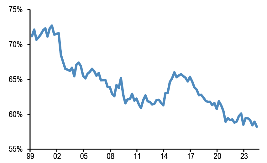
- There is little doubt that the pace of central bank purchases is key to gauging the future trajectory for gold prices into 2025. Central banks flocked into gold in 2022 after the Ukraine war erupted and sanctions on Russia were imposed. Even as the PBoC effectively paused its gold purchases since last April, we see tariffs/geopolitics inducing further diversification by central banks (including the PBoC) away from dollar reserves ( Figure 11) towards gold ( Figure 12).
Figure 11: Share of USD in FX reserves as reported in IMF COFER data
In %.
Source: IMF COFER, J.P. Morgan.
Figure 12: Quarterly gold purchases by the PBoC vs other central banks
Tonnes.

Source: World Gold Council, Bloomberg Finance L.P., J.P. Morgan.
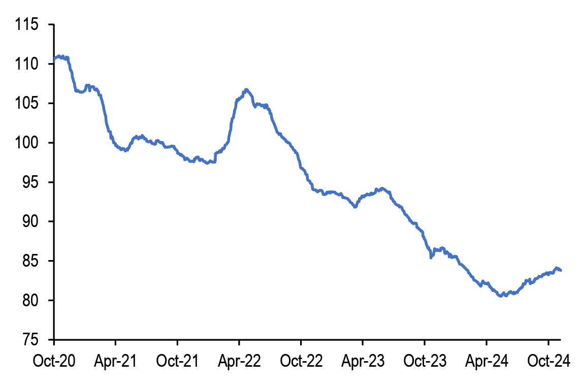
- Retail investors are also likely to continue to support gold into 2025. We discussed in our previous publications that retail investors have been embracing the “debasement trade” in a stronger manner during October by buying bitcoin and gold ETFs. This has been seen in the uptrend of gold ETF ( Figure 13) and spot bitcoin ETF flows ( Figure 14) since last summer, a trend that is likely to spill over into 2025. While there was some initial divergence with bitcoin reacting positively and gold reacting negatively to the US election result, as mentioned above Trump policies are likely to be supportive of both into 2025.
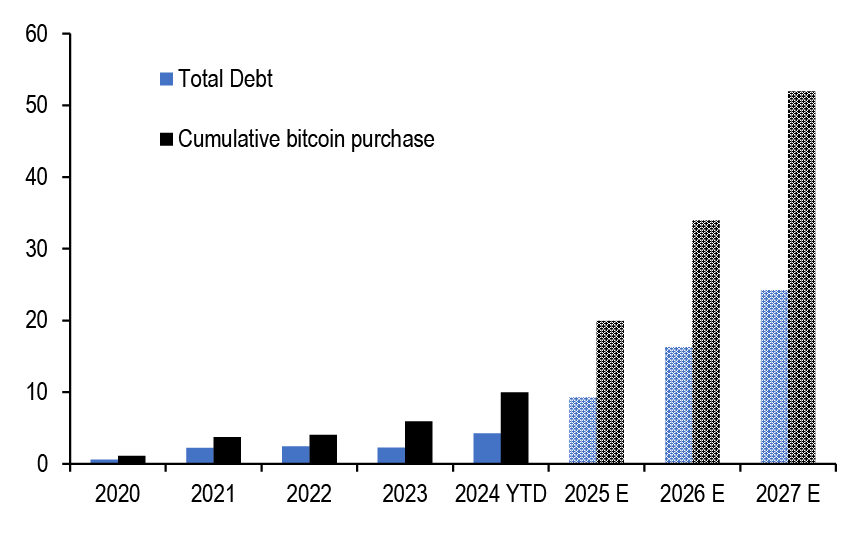
- Apart from Trump polices, bitcoin is likely to get additional support from MicroStrategy which announced an aggressive bitcoin acquisition program via its “21/21 plan”. The company aims at investing a massive $42bn into bitcoin over the next three years, which would be financed equally by debt and equity. For 2025 alone MicroStrategy would be investing $10bn into bitcoin which is roughly equal to its cumulative purchases so far since mid-2020! Figure 15 projects MicroStrategy’s debt and cumulative bitcoin purchases over the next three years.
Figure 13: Total Known ETF Holdings of Gold
Millions of troy ounces.
Source: Bloomberg Finance L.P., J.P. Morgan.
Figure 14: Net monthly Bitcoin ETF , Ethereum ETF and Leveraged MicroStrategy ETF flows
$bn

Source: Bloomberg Finance L.P., J.P. Morgan.
Figure 15: Cumulative bitcoin purchases and total debt held by MicroStrategy at the end of each year
$bn
Source: SEC Filings, Bloomberg Finance L.P., J.P. Morgan.
Recent declines in swap spreads a reminder of the ‘inconvenience’ of government bonds
- The recent notable declines in swap spreads have raised questions in our conversations over what has been behind the declines. Our colleagues in the US and European interest rate derivatives strategy (GFIMS, Nov 1st) note a number of factors that exacerbated the moves in recent weeks, with concerns over higher UST duration supply in the event of a sweep by either party as well as more near-term given auctions for the former, and a relative abundance of collateral availability as well as net interest income hedging needs by banks for the latter. These declines also come on the back of a declining trend in spreads that started in late 2022/early 2023 ( Figure 16).
Figure 16: Spread of 10y USD and EUR swaps to benchmark Treasury and German bond yields
In bps.

* EONIA -8.5bp before €STR data available.
Source: J.P. Morgan.
- Given the persistence in the declines over the past few years, we look at some potential longer-term drivers of swap spreads. Following the transition away from term Libor rates in swaps to overnight rates such as SOFR and €STR, the swap spread is effectively a difference between two risk-free or near risk-free rates. It can be thought of as a funding premium as holding a government bond requires using balance sheet capacity while an interest rate swap does not, though in the case of euro swap spreads a flight to intra-euro area safety premium can be a factor. A paper from the NY Fed (Understanding the “Inconvenience” of U.S. Treasury Bonds, Feb 2023) notes that a key factor in swap spreads has been an ‘inconvenience’ premium owing to dealer balance sheet constraints. In particular, it argues that as primary dealers shifted after the financial crisis from a negative net Treasury holdings to positive net holdings, and as regulations have tightened making deploying balance sheet capacity for banks more costly, Treasuries have become less ‘convenient’ to hold relative to swaps that are largely off-balance sheet (as only any accumulated losses on swaps are collateralised). In addition, the paper notes that central bank balance sheet policy will exert pressure on other financial intermediaries to absorb Treasury bonds, reducing this pressure when they expand balance sheets and increasing the pressure as balance sheet runoff returns bonds to private investors.
- Another potential driver for swap spreads arises from demand for duration from underfunded pension plans (e.g. in a BIS paper titled: An Explanation of Negative Swap Spreads: Demand for Duration from Underfunded Pension Plans, Feb 2018). The argument being that demand from underfunded pension funds to hedge duration, along with dealers’ balance sheet constraints, puts downward pressure on swap rates relative to Treasury yields.
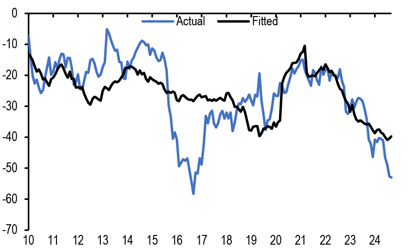
- To look at these medium-term drivers, we focus on 2y and 10y US OIS spreads to Treasuries, given that SOFR rates are only available from 2018. That said, swap spreads using OIS and SOFR rates track each other closely. We then regress these swap rates on primary dealer positions, the 12-month rolling change in the Fed’s SOMA bond holdings as a proxy of QE/QT policy, and the funded status of the 100 largest private defined benefit pension funds in the Milliman 100 index. Figure 17 shows the coefficients for these regressions, which are consistent with the above. In other words, higher primary dealer net Treasury positions put downward pressure on swap spreads, and higher Fed SOMA Treasury holdings and a higher funded status for defined benefit pension funds tends to put upward pressure on swap spreads. For 10y swap spreads, the latter variable was not statistically significant, possibly as longer dated yields (as an important determinant on the funded status of pension funds) are somehow correlated/captured by the other two variables in the model. Figure 18 shows the actual and fitted 10y US swap spread, which captures the declining trend in swap spreads since late 2022, consistent with the idea that these are notable medium-to-longer term drivers, though not the shorter-term variability.
Figure 17: Regression of 2y and 10y swap spreads to longer-term drivers.
| Sample (adjusted): 2010M01 2024M09 | ||||
| 2Y swap spread (bp) | 10y swap spread (bp) | |||
| Coefficient | T-stat | Coefficient | T-stat | |
| Intercept | 2.565 | 1.911 | -22.774 | -11.974 |
| Primary dealer net positions ($bn) | -0.074 | -8.724 | -0.060 | -4.968 |
| 12-month change in Fed SOMA bond holdings ($bn) | 0.003 | 4.564 | 0.006 | 7.611 |
| Milliman 100 Funded Status ($bn) | 0.021 | 5.839 | 0.002 | 0.394 |
| R-squared | 0.41 | 0.38 | ||
Source: J.P. Morgan.
Figure 18: Actual vs. fitted 10y US swap spread
In bps.
Source: J.P. Morgan.
- In all, the recent tightening in swap spreads comes against a backdrop of a narrowing trend and is a reminder of the rising ‘inconvenience’ of holding duration exposure via government bonds rather than swaps as government bond supply makes bank balance sheet constraints more visible.
Appendix
Chart A1: Global equity & bond fund flows
$bn per year of Net Sales, i.e. includes net new sales + reinvested dividends for Mutual Funds and ETFs globally, i.e. for funds domiciled both inside and outside the US. Flows come from ICI (worldwide data up to Q2’24). Data since then are a combination of monthly and weekly data from Lipper, EPFR and ETF flows from Bloomberg Finance L.P.

Source: ICI, EPFR, Lipper, Bloomberg Finance L.P., J.P. Morgan.
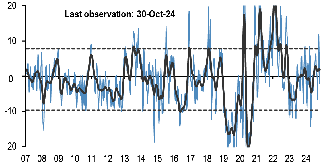
Chart A2: Fund flow indicator
Difference between flows into Equity and Bond funds: $bn per week. Difference between flows into Equity vs. Bond funds in $bn per week. Flows include Mutual Fund and ETF flows globally, i.e. funds domiciled both inside and outside the US (source: EPFR) The thin blue line shows the 4-week average of difference between Equity and Bond fund flows. Dotted lines depict ±1 StDev of the blue line. The thick black line shows a smoothed version of the same series. The smoothing is done using a Hodrick-Prescott filter with a Lambda parameter of 100.
Source: EPFR, J.P. Morgan.
Table A1: Flow Monitor
$bn per week. The first two rows include Mutual Fund and ETF flows globally, i.e.flows for funds domiciled both inside and outside the US(source: EPFR). The last four rows only include funds domiciled in the US.International Equity funds are equity funds domiciled in the US that invest outside the US (source: ICI and Bloomberg Finance L.P.).
| MF & ETF Flows | 30-Oct | 4 wk avg | 13 wk avg | 2024 avg |
| All Equity | -1.4 | 15.9 | 14.6 | 11.8 |
| All Bond | 18.0 | 18.0 | 15.0 | 12.5 |
| US Equity | -7.7 | -2.0 | -4.1 | -3.9 |
| US Bonds | 5.7 | 10.0 | 8.6 | 7.6 |
| Non-US Equity | 6.3 | 17.9 | 18.6 | 15.5 |
| Non-US Bonds | 12.3 | 8.1 | 6.3 | 5.0 |
| US Taxable Bonds | 9.2 | 5.9 | 6.2 | 5.1 |
| US Municipal Bonds | 1.19 | 0.46 | 0.33 | 0.15 |
| US HG Bonds | 8.9 | 7.9 | 5.4 | 4.5 |
| US HY Bonds | 0.37 | 0.06 | 0.01 | 0.28 |
| US MMFs | 10.68 | 14.2 | 25.9 | 12.6 |
| UCITS Flows | Jul-24 | 3 mth avg | 2023 avg | 2024 avg |
| Euro MMFs | 34.3 | 16.5 | 15.6 | 11.8 |
| Euro Equities | 9.9 | 17.7 | 0.6 | 9.0 |
| Euro Bonds | 30.5 | 27.1 | 12.3 | 28.7 |
Source: ICI, EPFR, EFAMA, Bloomberg Finance L.P., and J.P. Morgan.
Table A2: Trading turnover monitor
Volumes are monthly and Turnover ratio is annualised (monthly trading volume annualised divided by the amount outstanding). UST Cash is primary dealer transactions in all US government securities. UST futures are from Bloomberg Finance L.P. JGBs are OTC volumes in all Japanese government securities. Bunds, Gold, Oil and Copper are futures. Gold includes Gold ETFs. Min-Max chart is based on Turnover ratio. For Bunds and Commodities, futures trading volumes are used while the outstanding amount is proxied by open interest. The diamond reflects the latest turnover observation. The thin blue line marks the distance between the min and max for the complete time series since Jan-2005 onwards. Y/Y change is change in YTD notional volumes over the same period last year.

Source: Bloomberg Finance L.P., Federal Reserve, Trace, Japan Securities Dealer Association, WFE, J.P. Morgan.
ETF Flow Monitor (as of 6th Nov)
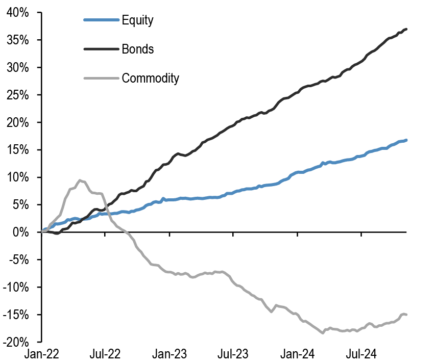
Chart A3: Global Cross Asset ETF Flows
Cumulative flow into ETFs as a % of AUM
Source: Bloomberg Finance L.P., J.P. Morgan.
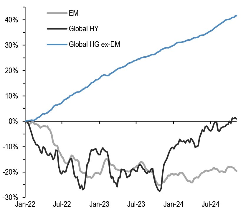
Chart A4: Bond ETF Flows
Cumulative flow into bond ETFs as a % of AUM
Source: Bloomberg Finance L.P., J.P. Morgan.
Chart A5: Global Equity ETF Flows
Cumulative flow into global equity ETFs as a % of AUM
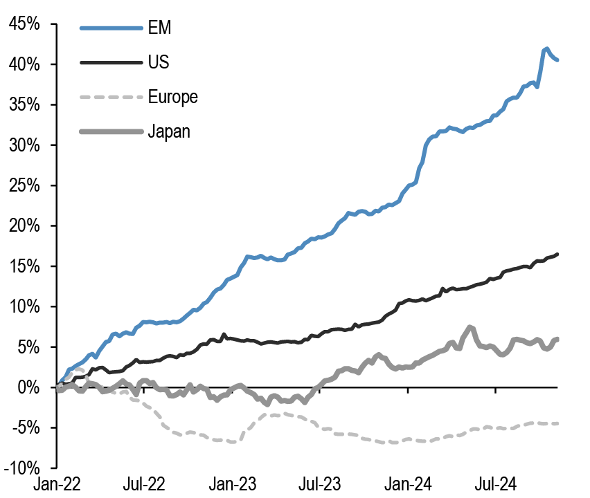
Source: Bloomberg Finance L.P., J.P. Morgan. Note: We include ETFs with AUM > $200mn in all the flow monitor charts. Chart A5 exclude China On-shore (A-share) ETFs from EM and in Japan. We subtract the BoJ buying of ETFs.
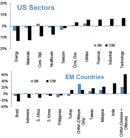
Chart A6: Equity Sectoral and Regional ETF Flows
Rolling 3-month and 12-month change in cumulative flows as a % of AUM. Both sorted by 12-month change
Source: Bloomberg Finance L.P., J.P. Morgan.
Short Interest Monitor
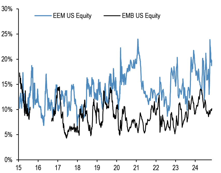
Chart A7: Short interest on the EEM and EMB US ETF
Short Interest as a % share of share outstanding.
Source: S3, J.P. Morgan
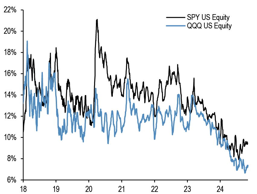
Chart A9: Short interest on the SPY and QQQ US ETF
Short Interest as a % share of share outstanding. Last obs is for 4th November 2024.
Source: S3, J.P. Morgan
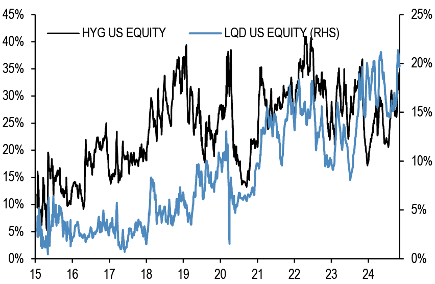
Chart A8: Short interest on the LQD and HYG US ETF
Short Interest as a % share of share outstanding.
Source: S3, J.P. Morgan
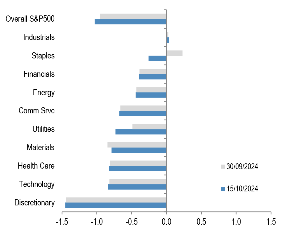
Chart A10: S&P500 sector short interest
Short interest as a % of shares outstanding based on z-scores. A strategy which overweights the S&P500 sectors with the highest short interest z-score (as % of shares o/s) vs. those with the lowest, produced an information ratio of 0.7 with a success rate of 56% (see F&L, Jun 28,2013 for more details).
Source: NYSE, Bloomberg Finance L.P., J.P. Morgan
Chart A11a: Cross Asset Volatility Monitor 3m ATM Implied Volatility (1y history), as of 5th Nov-2024
This table shows the richness/cheapness of current three-month implied volatility levels (red dot) against their one-year historical range (thin blue bar) and the ratio to current realised volatility. Assets with implied volatility outside their 25th/75th percentile range (thick blue bar) are highlighted. The implied-to-realised volatility ratio uses 3-month implied volatilities and 1-month (around 21 trading days) realised volatilities for each asset.
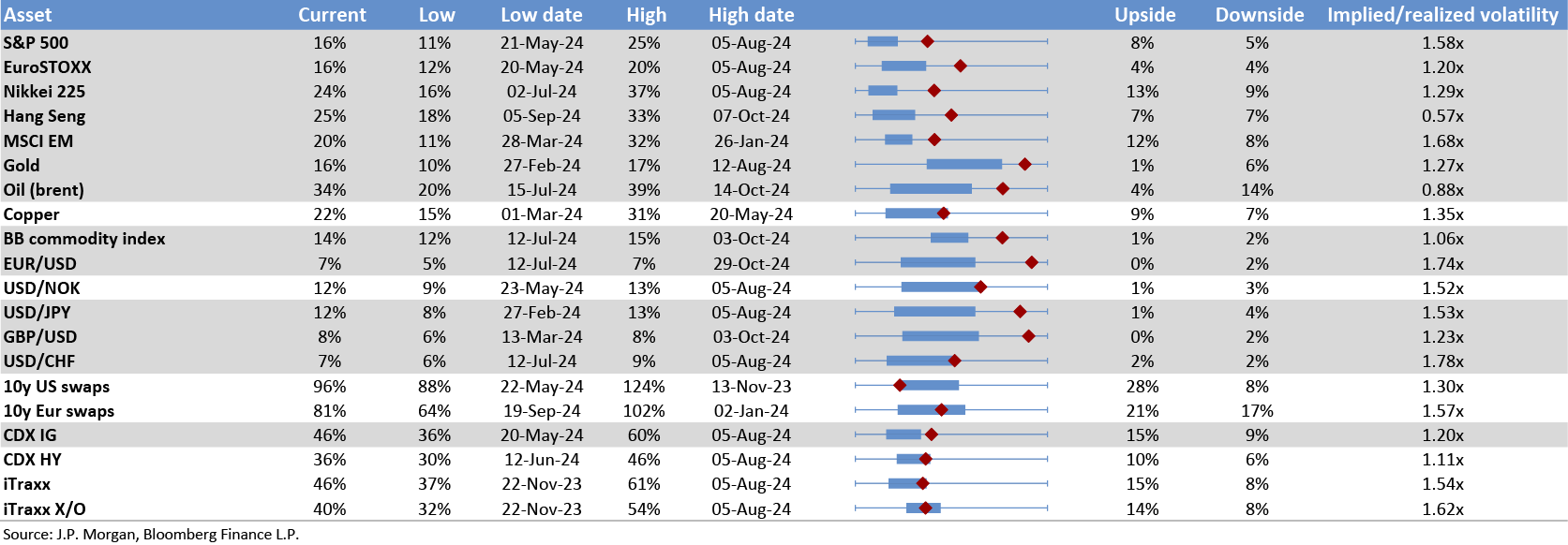

Chart A11b: Option skew monitor
Skew is the difference between the implied volatility of out-of-the-money (OTM) call options and put options. A positive skew implies more demand for calls than puts and a negative skew, higher demand for puts than calls. It can therefore be seen as an indicator of risk perception in that a highly negative skew inequities is indicative of a bearish view. The chart shows z-score of the skew, i.e. the skew minus a rolling 2-year avg skew divided by a rolling two-year standard deviation of the skew. A negative skew on iTraxx Main means investors favour buying protection, i.e. a short risk position. A positive skew for the Bund reflects a long duration view, also a short risk position.

Source: J.P. Morgan.
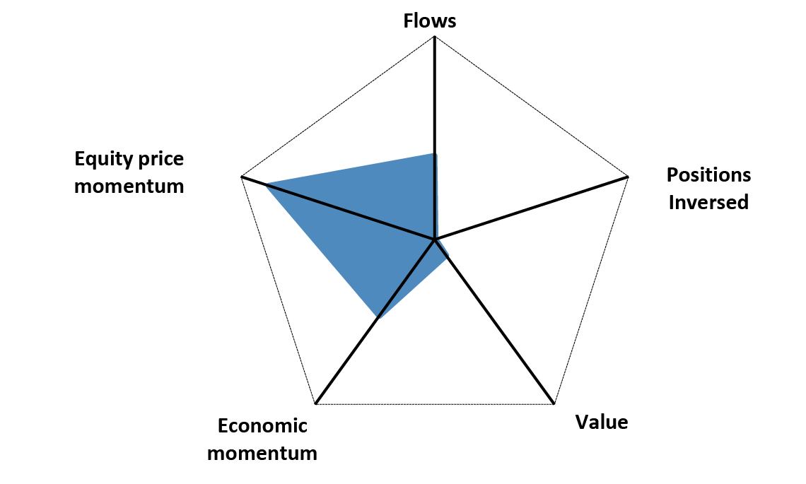
Chart A11c: Equity-Bond metric map
Explanation of Equity - Bond metric map: Each of the five axes corresponds to a key indicator for markets. The position of the blue line on each axis shows how far the current observation is from the extremes at either end of the scale. For example, a reading at the centre for value would mean that risky assets are the most expensive they have ever been while a reading at the other end of the axis would mean they are the cheapest they have ever been. Overall, the larger the blue area within the pentagon, the better for the risky markets. All variables are expressed as the percentile of the distribution that the observation falls into. I.e. a reading in the middle of the axis means that the observation falls exactly at the median of all historical observations. Value: The slope of the risk-return trade-off line calculated across USTs, US HG and HY corporate bonds and US equities(see GMOS p. 6, Loeys et al, Jul 6 2011 for more details). Positions: Difference between net spec positions on US equities and intermediate sector UST. See Chart A13. Flow momentum: The difference between flows into equity funds (incl. ETFs) and flows into bond funds. Chart A1. We then smooth this using a Hodrick-Prescott filter with a lambda parameter of 100. We then take the weekly change in this smoothed series as shown in Chart A1. Economic momentum:The 2-month change in the global manufacturing PMI. (See REVISITING: Using the Global PMI as trading signal, Nikolaos Panigirtzoglou, Jan 2012). Equity price momentum: The 6-month change in the S&P500 equity index. As of 2nd Nov 24.
Source: Bloomberg Finance L.P., J.P. Morgan.
Spec position monitor
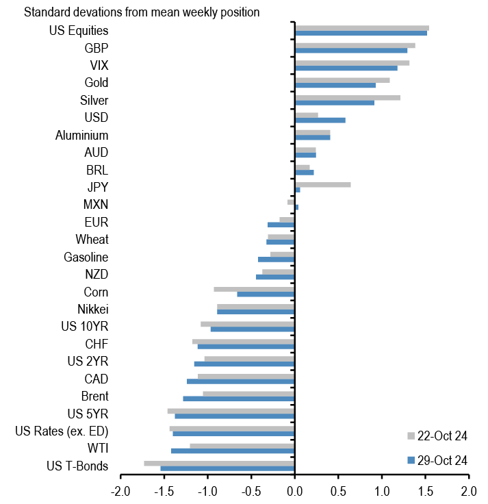
Chart A12: Weekly Spec Position Monitor
Net spec positions are proxied by the number of long contracts minus the number of short contracts using the speculative category of the Commitments of Traders reports (as reported by CFTC). To proxy for speculative investors for equity and US Treasury bond futures positions we use Asset managers and leveraged funds (see Chart A13), whereas for other assets we use the legacy Non-Commercial category. This net position is then converted to a dollar amount by multiplying by the contract size and then the corresponding futures price. We then scale the net positions by open interest. The chart shows the z-score of these net positions. US rates is a duration-weighted composite of the individual UST futures contracts excluding the Eurodollar contract.
Source: Bloomberg Finance L.P., CFTC, J.P. Morgan
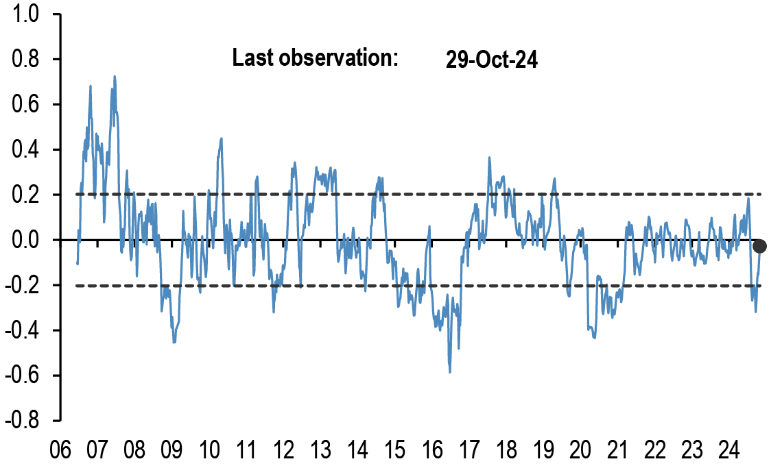
Chart A14: Spec position indicator on Risky vs. Safe currencies
Difference between net spec positions on risky & safe currencies. Net spec position is calculated in USD across 5 ‘risky’ and 3 ‘safe’ currencies (safe currencies also include Gold). These positions are then scaled by open interest and we take an average of ‘risky’ and ‘safe’ assets to create two series. The chart is then simply the difference between the“risky” and “safe” series. The final series shown in the chart below is demeaned using data since 2006. The risky currencies are: AUD, NZD,CAD, MXN and BRL. The safe currencies are: JPY, CHF and Gold.
Source: Bloomberg Finance L.P., CFTC, J.P. Morgan.
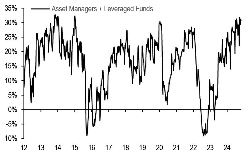
Chart A13: Positions in US equity futures by Asset managers and Leveraged funds
CFTC positions in US equity futures by Leveraged funds and Asset managers (as a % of open interest). It is an aggregate of the S&P500, DowJones, NASDAQ and their Mini futures contracts.
Source: CFTC, Bloomberg Finance L.P. and J.P. Morgan
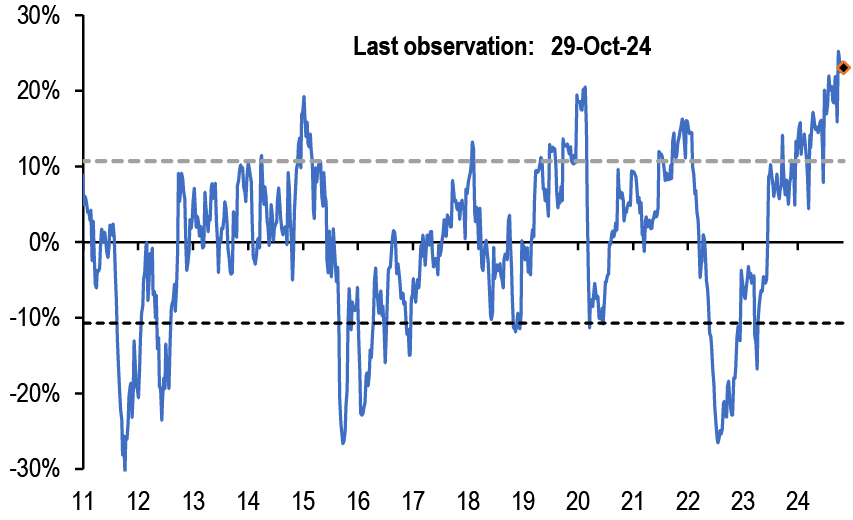
Chart A15: Spec position indicator on US equity futures vs. intermediate sector UST futures
Difference between net spec positions on US equity futures vs.intermediate sector UST futures. This indicator is derived by the difference between total CFTC positions in US equity futures by Asset managers + Leveraged Funds scaled by open interest minus the Asset managers + Leveraged Funds spec position on intermediate sector UST futures (i.e. all UST futures duration weighted ex ED and ex 2Y UST futures) also scaled by open interest.
Source: CFTC, Bloomberg Finance L.P. and J.P. Morgan
Mutual fund and hedge fund betas
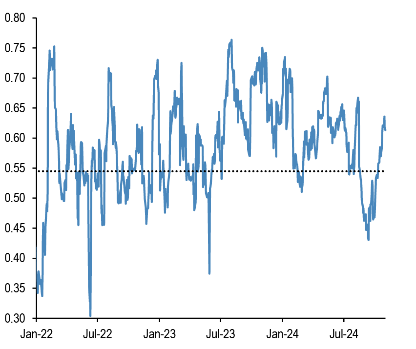
Chart A16: 21-day rolling beta of 20 biggest active US bond mutual fund managers with respect to the US Agg Bond Index
The dotted line shows the average beta since 2013.

Source: Bloomberg Finance L.P., J.P. Morgan.
Chart A17: 21-day rolling beta of 20 biggest active Euro bond mutual fund managers with respect to the Euro Agg Bond Index
The dotted line shows the average beta since 2013.
Source: Bloomberg Finance L.P., J.P. Morgan.
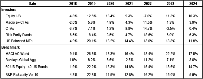
Chart A18: Performance of various type of investors
The table depicts the performance of various types of investors in % as of 5th Nov 2024.
Source: Bloomberg Finance L.P., HFR, Pivotal Path, J.P. Morgan.
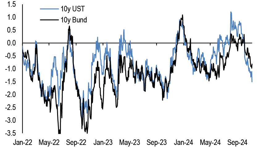
Chart A19: Momentum signals for 10Y UST and 10Y Bunds
Average z-score of Short- and Long-term momentum signal in our Trend Following Strategy framework shown in Tables A3 and A4 below in the Appendix
Source: Bloomberg Finance L.P., J.P. Morgan.
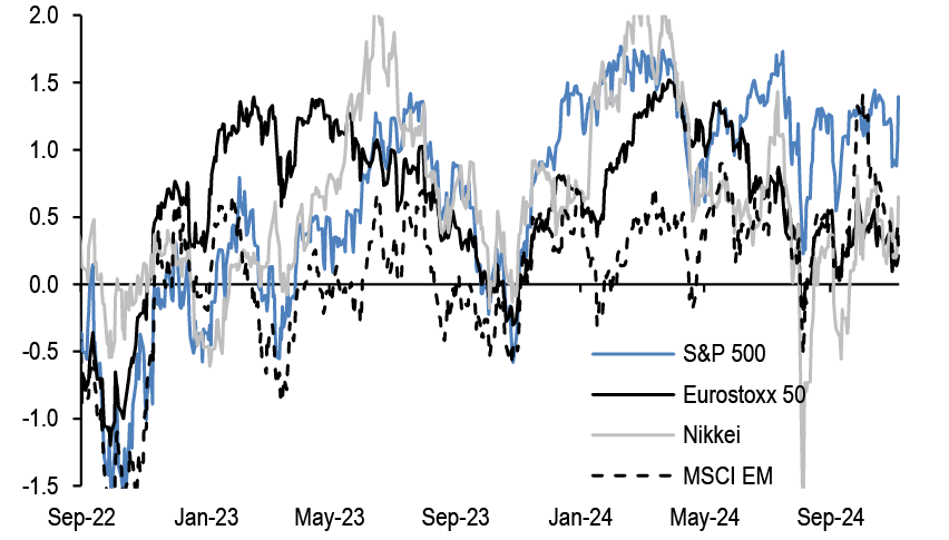
Chart A20: Momentum signals for S&P500
Average z-score of Short- and Long-term momentum signal in our Trend Following Strategy framework shown in Tables A3 and A4 below in the Appendix.
Source: Bloomberg Finance L.P., J.P. Morgan.
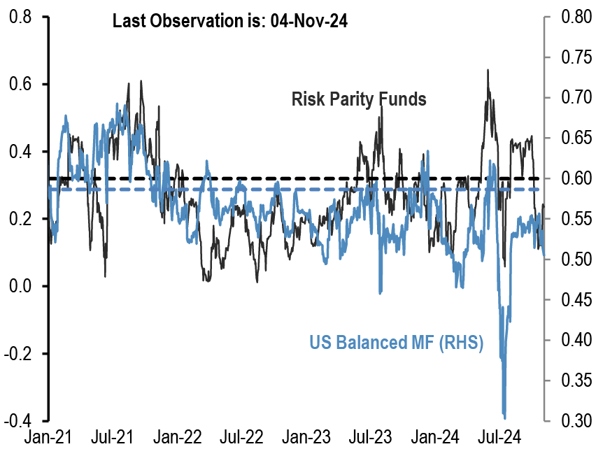
Chart A21: Equity beta of US Balanced Mutual funds and Risk Parity funds
Rolling 21-day equity beta based on a bivariate regression of the daily returns of our Balanced Mutual fund and Risk Parity fund return indices to the daily returns of the S&P 500 and BarCap US Agg indices. Given that these funds invest in both equities and bonds we believe that the bivariate regression will be more suitable for these funds. Our risk parity index consists of 25 daily reporting Risk Parity funds. Our Balanced Mutual fund index includes the top 20 US-based active funds by assets and that have existed since 2006. Our Balanced Mutual fund index has a total AUM of$700bn, which is around half of the total AUM of $1.5tr of US based Balanced funds which we believe to be a good proxy of the overall industry It excludes tracker funds and funds with a low tracking error. Dotted lines are average since 2015.
Source: Bloomberg Finance L.P., J.P. Morgan.
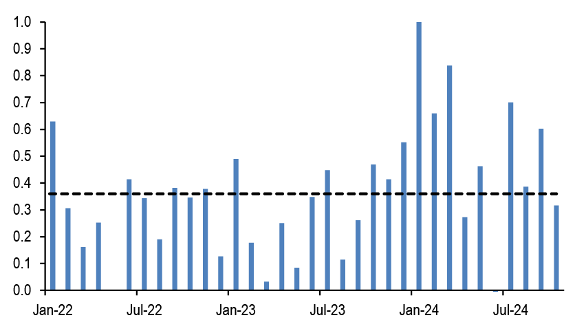
Chart A22: Equity beta of monthly reporting Equity Long/Short hedge funds
Proxied by the ratio of the monthly performance of Pivotal Path Asset-Weighted Equity Hedge fund index divided by the monthly performance of MSCI ACWorld Index.
Source: Bloomberg Finance L.P., Pivotal Path, J.P. Morgan
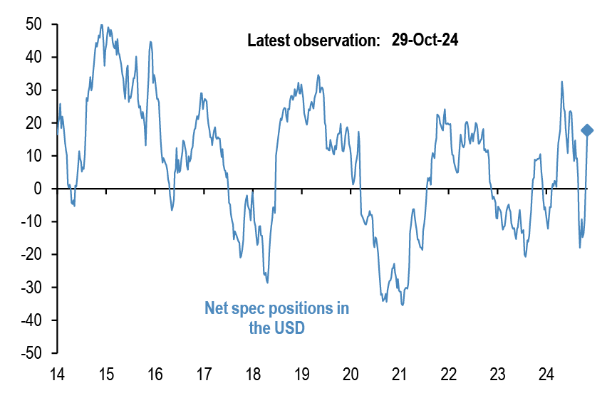
Chart A23: USD exposure of currency hedge funds
The net spec position in the USD as reported by the CFTC. Spec is the non-commercial category from the CFTC.
Source: CFTC, Barclay, Datastream, Bloomberg Finance L.P., J.P. Morgan.
CTAs – Trend following investors’ momentum indicators
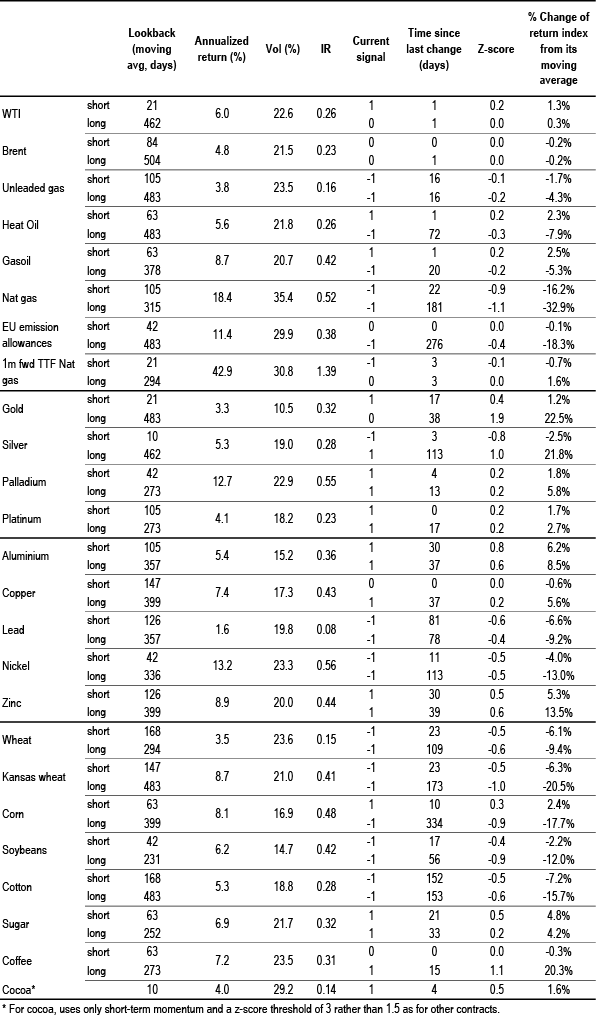
Table A3: Simple return momentum trading rules across various commodities
Optimal look-back period of each momentum strategy combined with a mean reversion indicator that turns signal neutral when momentum z-score more than 1.5 standard deviations above or below mean, and a filter that turns neutral when the z-score is low (below 0.05 and above -0.05) to avoid excessive trading. Look-backs, current signals and z-scores are shown for shorter-term and longer-term momentum separately, along with performance of a combined signal. Annualised return, volatility and information ratio of the signal; current signal; and z-score of the current return over the relevant look-back period; data from 1999 onward.
Source: Bloomberg Finance L.P., J.P. Morgan calculations.
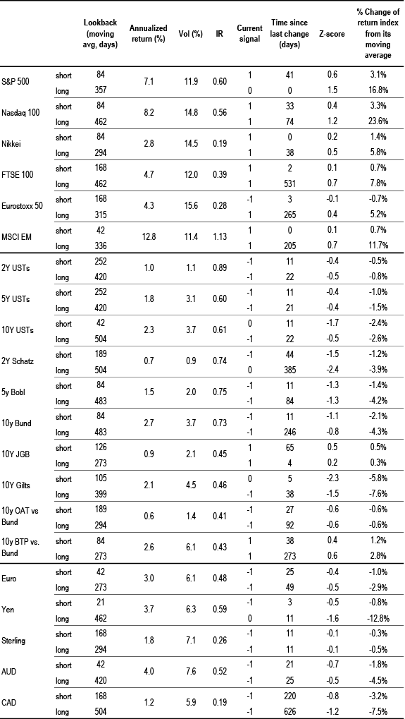
Table A4: Simple return momentum trading rules across international equity indices, bond futures and FX
Optimal look-back period of each momentum strategy combined with a mean reversion indicator that turns signal neutral when momentum z-score more than 1.5 standard deviations above or below mean, and a filter that turns neutral when the z-score is low (below 0.05 and above -0.05) to avoid excessive trading. Look-backs, current signals and z-scores are shown for shorter-term and longer-term momentum separately, along with performance of a combined signal. Annualised return, volatility and information ratio of the signal; current signal; and z-score of the current return over the relevant look-back period; data from 1999 onward.
Source: Bloomberg Finance L.P., J.P. Morgan calculations.
Corporate Activity
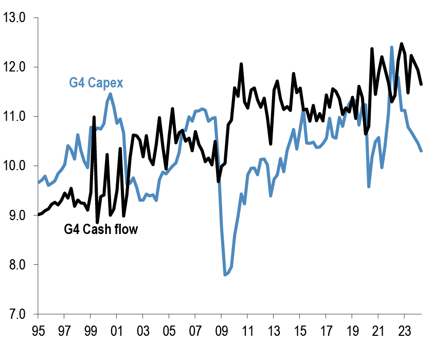
Chart A24: G4 non-financial corporate capex and cash flow as % of GDP
% of GDP, G4 includes the US, the UK, the Euro area and Japan. Last observation as of Q2 2024.
Source: ECB, BOJ, BOE, Federal Reserve flow of funds, J.P. Morgan.
Chart A25: G4 non-financial corporate sector net debt and equity issuance
$tr per quarter, G4 includes the US, the UK, the Euro area and Japan. Last observation as of Q2 2024.
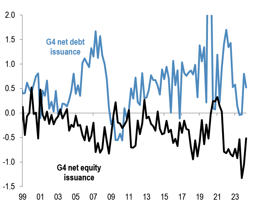
Source: ECB, BOJ, BOE, Federal Reserve flow of funds, J.P. Morgan.
Chart A26: Global M&A and LBO
$tr. M&A and LBOs are announced.
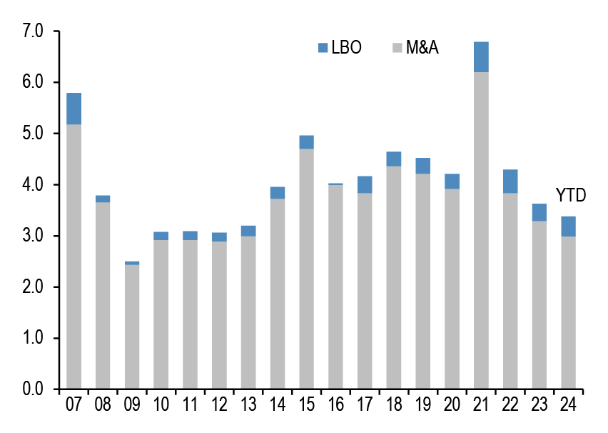
Source: Dealogic, J.P. Morgan.
Chart A27: US and non-US share buyback
$bn, are as of November. Buybacks are announced.
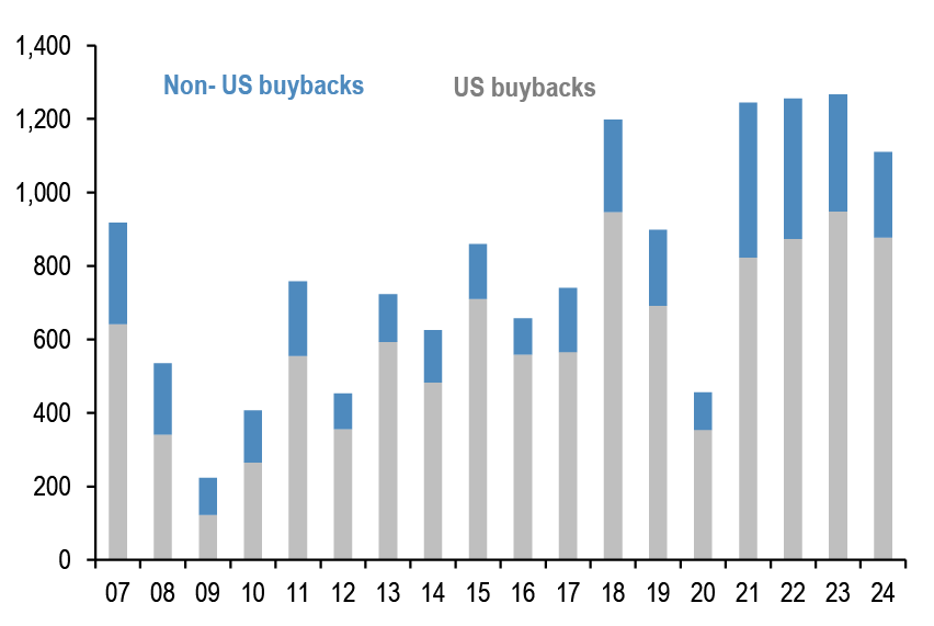
Source: Bloomberg Finance L.P., Thomson Reuters, J.P. Morgan
Pension fund and insurance company flows
Chart A28: G4 pension funds and insurance companies equity and bond flows
Equity and bond buying in $bn per quarter. G4 includes the US, the UK,Euro area and Japan. Last observation is Q2 2024.

Source: ECB, BOJ, BOE, Federal Reserve flow of funds, J.P. Morgan.
Chart A29: G4 pension funds and insurance companies equity and bond levels
Equity and bond as % of total assets per quarter. G4 includes the US, the UK, Euro area and Japan. Last observation is Q2 2024.
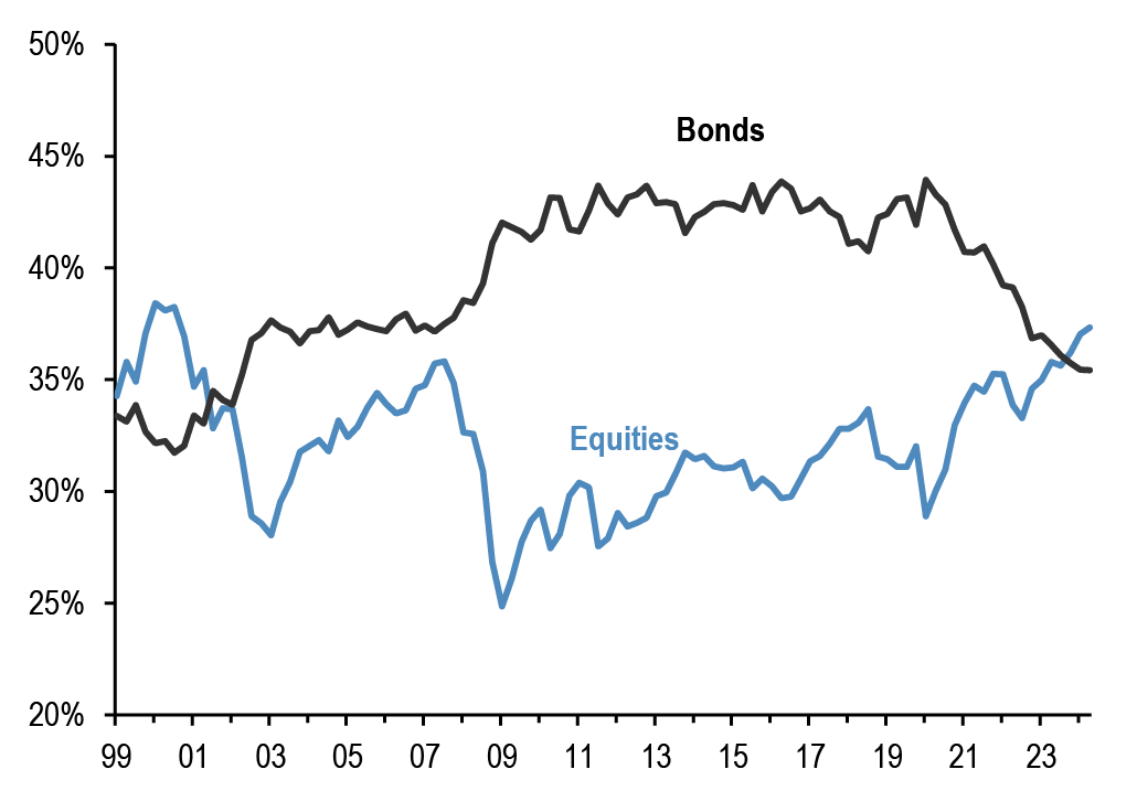
Source: ECB, BOJ, BOE, Federal Reserve flow of funds., J.P. Morgan
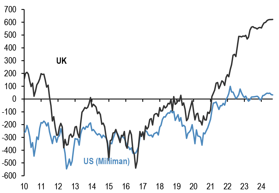
Chart A30: Pension fund deficits
US$bn. For US, funded status of the 100 largest corporate defined benefit pension plans, from Milliman. For UK, funded status of the defined benefit schemes eligible for entry to the Pension Protection Fund, converted to US$ at today’s exchange rates.
Last obs. is September’24 for US & UK.
Source: Milliman, UK Pension Protection Fund, J.P. Morgan.
Chart A31: G4 pension funds and insurance companies cash and alternatives levels
Cash and alternative investments as % of total assets per quarter. G4 includes the US, the UK, Euro area and Japan. Last observation is Q2 2024.

Source: ECB, BOJ, BOE, Federal Reserve flow of funds, J.P. Morgan.
Credit Creation
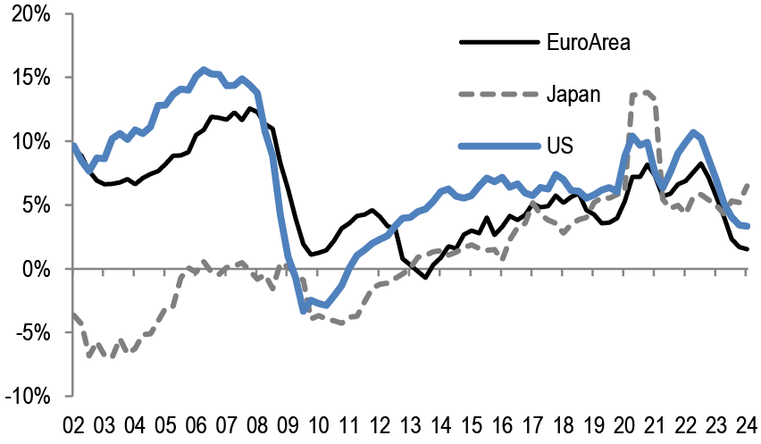
Chart A32: Credit creation in the US, Japan and Euro area
Rolling sum of 4-quarter credit creation as % of GDP. Credit creation includes both bank loans as well as net debt issuance by non-financial corporations and households. Last obs. is Q2’24 for Japan, Euro Area and US.
Source: Fed, ECB, BoJ, Bloomberg Finance L.P., and J.P. Morgan calculations.
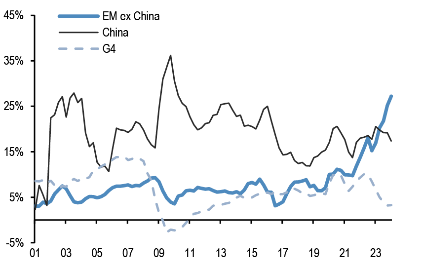
Chart A33: Credit creation in EM
Rolling sum of 4-quarter credit creation as % of GDP. Credit creation includes both bank loans as well as net debt issuance by non-financial corporations and households. Last obs. is for Q1’24.
Source: G4 Central banks FoF, BIS, ICI, Barcap, Bloomberg Finance L.P., IMF, and J.P.Morgan calculation
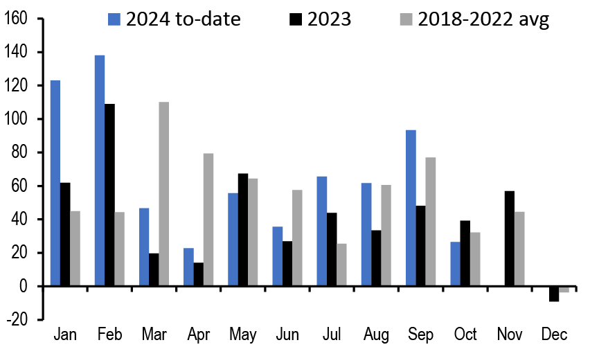
Chart A34: Monthly net issuance of US HG bonds
$bn. October 2024.
Source: Dealogic, J.P. Morgan
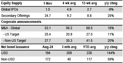
Table A5: Equity and Bond issuance
$bn, Equity supply and corporate announcements are based on announced deals, not completed. M&A is announced deal value and buybacks are announced transactions. Y/Y change is change in YTD announcements over the same period last year.
Source: Bloomberg Finance L.P., Dealogic, Thomson Reuters, J.P. Morgan.
Bitcoin monitor
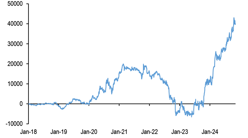
Chart A35: Our Bitcoin position proxy based on open interest in CME Bitcoin futures contracts
In number of contracts. Last obs. for 5th November 2024.
Source: Bloomberg Finance L.P., J.P. Morgan
Chart A36: Cumulative Flows in all Bitcoin funds and Gold ETF holdings
Both the y-axis in $bn.

Source: Bloomberg Finance L.P., J.P. Morgan.
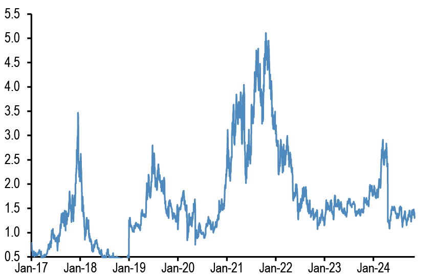
Chart A37: Ratio of bitcoin market price to production cost
Based on the cost of production approach following Hayes (2018).
Source: Coin Metrics, J.P. Morgan
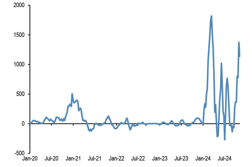
Chart A38: Flow pace into publicly-listed bitcoin funds including bitcoin ETFs
$mm per week, 4-week rolling average flow.
Source: Bloomberg Finance L.P., J.P. Morgan.
Japanese flows and positions
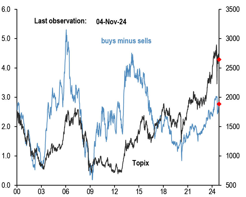
Chart A39: Tokyo Stock Exchange margin trading: total buys minus total sells
In bn of shares. Topix on right axis.
Source: Tokyo Stock Exchange, Bloomberg Finance L.P., J.P. Morgan.
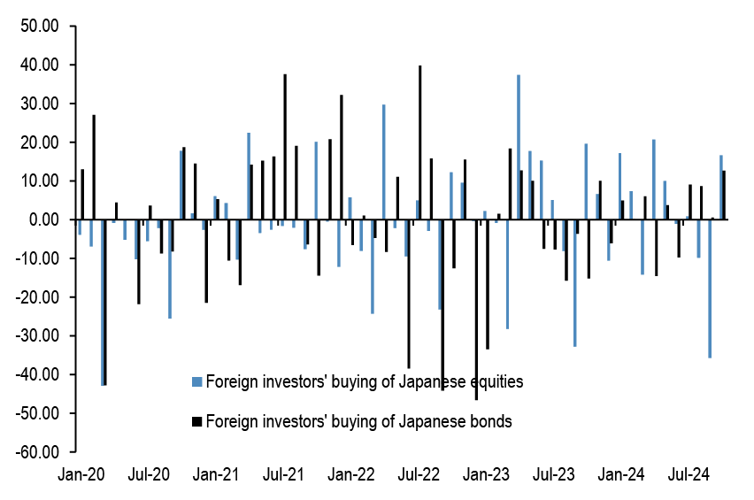
Chart A40: Monthly net purchases of Japanese bonds and Japanese equities by foreign residents
$bn, Last weekly obs. is for 25th Oct’ 24.
Source: Japan MoF, Bloomberg Finance L.P., and J.P. Morgan.
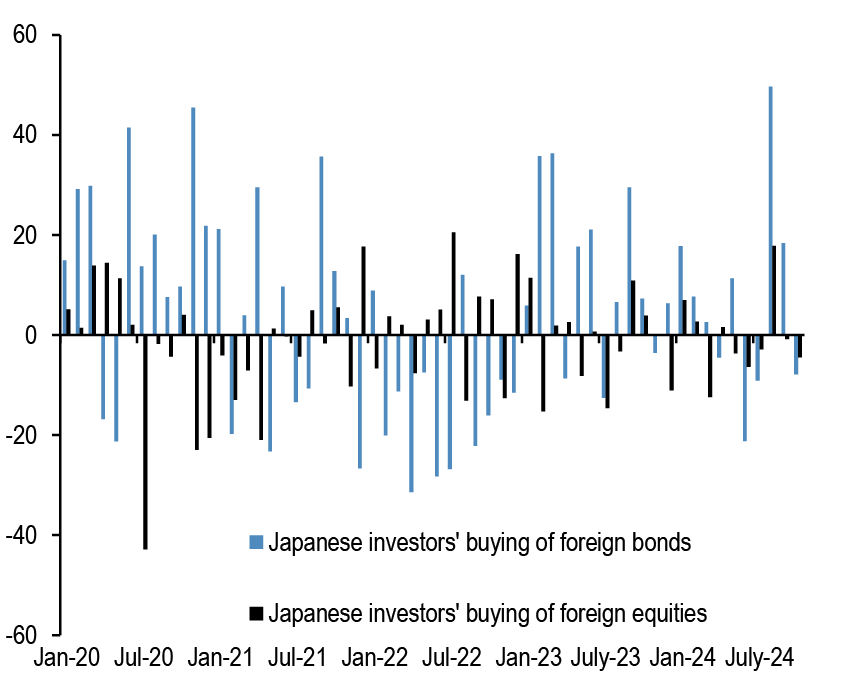
Chart A41: Monthly net purchases of foreign bonds and foreign equities by Japanese residents
$bn, Last weekly obs. is for 25th Oct’ 24.
Source: Japan MoF, Bloomberg Finance L.P., and J.P. Morgan.
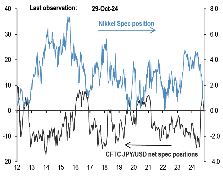
Chart A42: Overseas CFTC spec positions
CFTC spec positions are in $bn. For Nikkei we use CFTC positions in Nikkei futures (USD & JPY) by Leveraged funds and Asset managers.
Source: Bloomberg Finance L.P., CFTC, J.P. Morgan calculations.
Commodity flows and positions
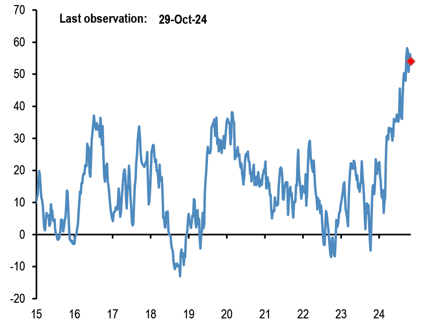
Chart A43: Gold spec positions
$bn. CFTC net long minus short position in futures for the Managed Money category.
Source: CFTC, Bloomberg Finance L.P., J.P. Morgan.
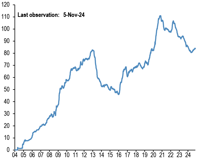
Chart A44: Gold ETFs
Mn troy oz. Physical gold held by all gold ETFs globally.
Source: Bloomberg Finance L.P., J.P. Morgan.
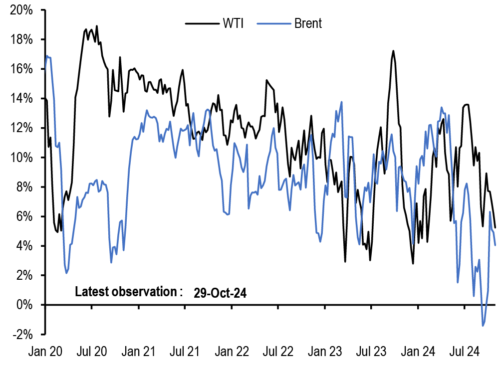
Chart A45: Oil spec positions
Net spec positions divided by open interest. CFTC futures positions for WTI and Brent are net long minus short for the Managed Money category.
Source: CFTC, Bloomberg Finance L.P., J.P. Morgan.
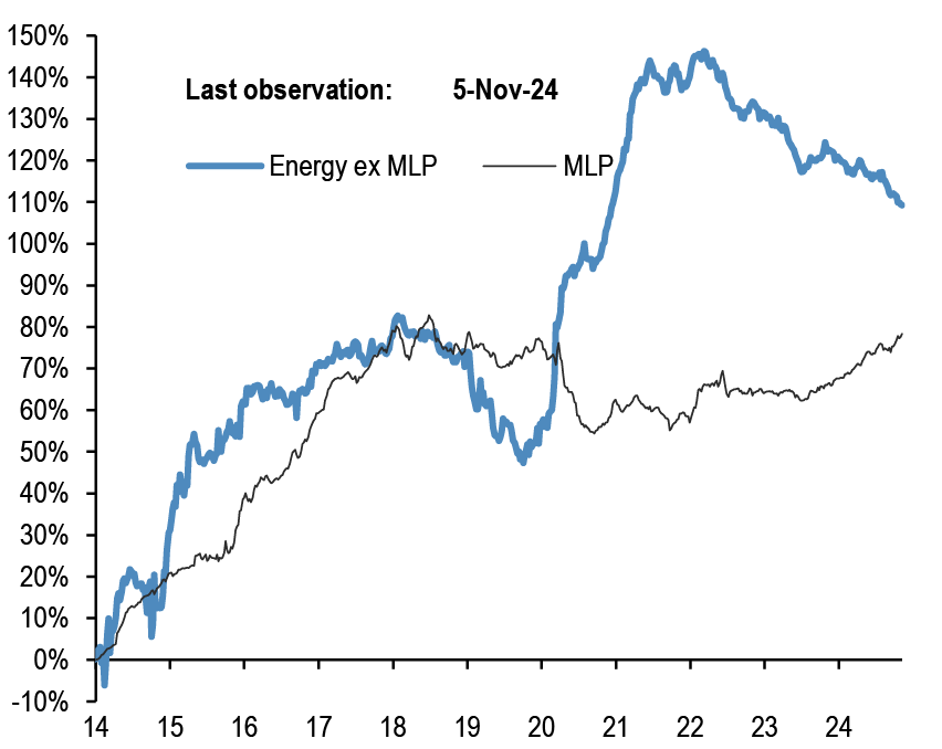
Chart A46: Energy ETF flows
Cumulative energy ETFs flow as a % of AUM. MLP refers to the Alerian MLP ETF.
Source: CFTC, Bloomberg Finance L.P., J.P. Morgan.
Corporate FX hedging proxies
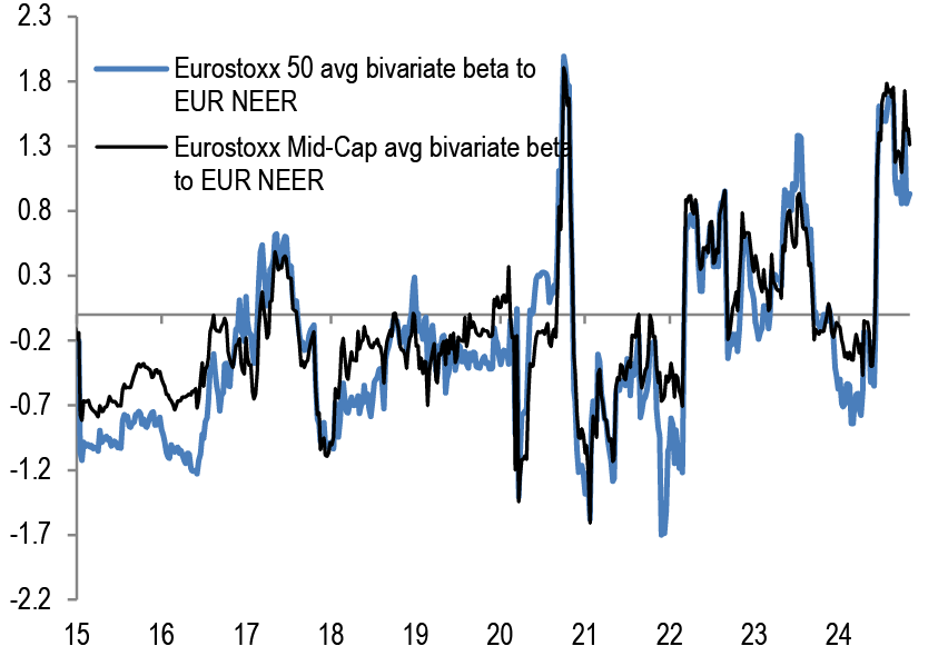
Chart A47: Average beta of Eurostoxx 50 companies and Eurostoxx Mid-Cap to trade-weighted EUR
Rolling 26 weeks average betas based on a bivariate regression of the weekly returns of individual stocks in the Eurostoxx 50 index to the weekly returns of the MSCI AC World and JPM EUR Nominal broad effective exchange rate (NEER).
Source: Bloomberg Finance L.P., J.P. Morgan
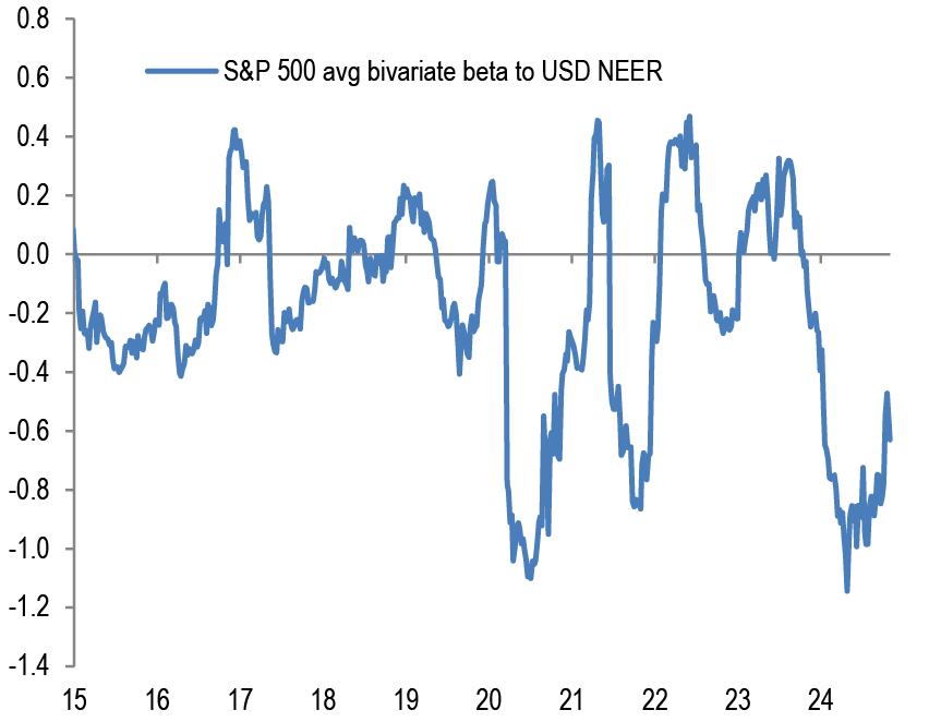
Chart A48: Average beta of S&P500 companies to trade-weighted US dollar
Rolling 26 weeks average betas based on a bivariate regression of the weekly returns of stocks in the S&P500 index to the weekly returns of the MSCI AC World and JPM USD Nominal broad effective exchange rate(NEER).
Source: Bloomberg Finance L.P., J.P. Morgan
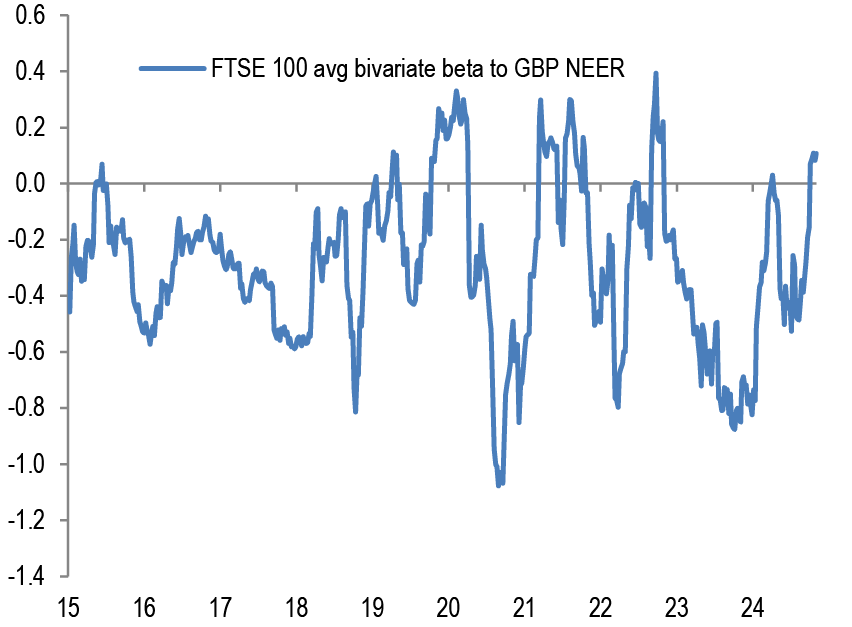
Chart A49: Average beta of FTSE 100 companies to trade-weighted GBP
Rolling 26 weeks average betas based on a bivariate regression of the weekly returns of individual stocks in the FTSE 100 index to the weekly returns of the MSCI AC World and JPM GBP Nominal broad effective exchange rate (NEER).
Source: Bloomberg Finance L.P., J.P. Morgan
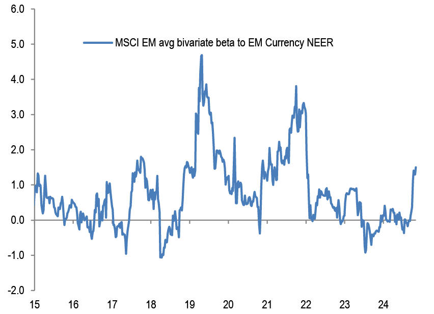
Chart A50: Average beta of MSCI EM companies to trade-weighted EM Currency Index
Rolling 26 weeks average betas based on a bivariate regression of the weekly returns of individual stocks in the MSCI EM index to the weekly returns of the MSCI AC World and JPM EM Nominal broad effective exchange rate (NEER).
Source: Bloomberg Finance L.P., J.P. Morgan
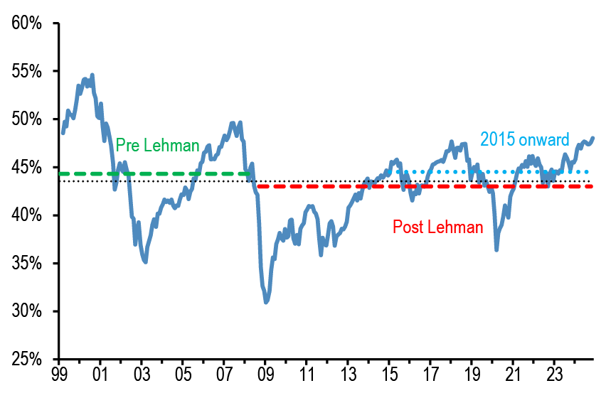
Non-Bank investors’ implied allocations
Chart A51: Implied equity allocation by non-bank investors globally
Global equities as % total holdings of equities/bonds/M2 by non-bank investors. Dotted lines are averages.
Source: Bloomberg Finance L.P., J.P. Morgan
Chart A52: Implied bond allocation by non-bank investors globally
Global bonds as % total holdings of equities/bonds/M2 by non-bank investors. Dotted lines are averages.

Source: Bloomberg Finance L.P., J.P. Morgan
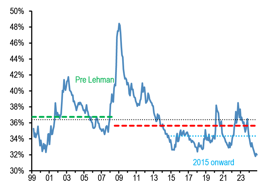
Chart A53: Implied cash allocation by non-bank investors globally
Global cash held by non-bank investors as % total holdings of equities/bonds/M2 by non-bank investors. Dotted lines are averages.
Source: Bloomberg Finance L.P., J.P. Morgan
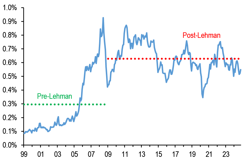
Chart A54: Implied commodity allocation by non-bank investors globally
Proxied by the open interest of commodity futures ex gold as % of the stock of equities, bonds and cash held by non-bank investors globally.
Source: Bloomberg Finance L.P., J.P. Morgan