
Flows & Liquidity
Updated equity demand and supply for H2
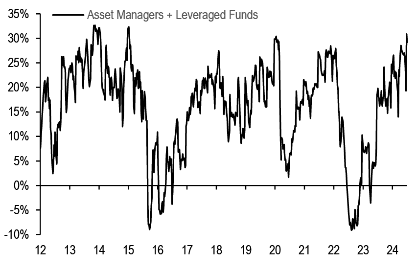
- The increase in US equity futures positions to very elevated levels, with the net longs of Asset Managers and Leveraged funds as a % of open interest recently having reached their highest level in a decade, along with an elevated positioning of momentum traders, leaves equities vulnerable.
- Our global equity demand-supply analysis suggests this increased long positions, along with a more negative equity supply backdrop, has supported equities in 1H24, but also represents a significant headwind for 2H24 assuming some mean reversion in positioning by institutional investors.
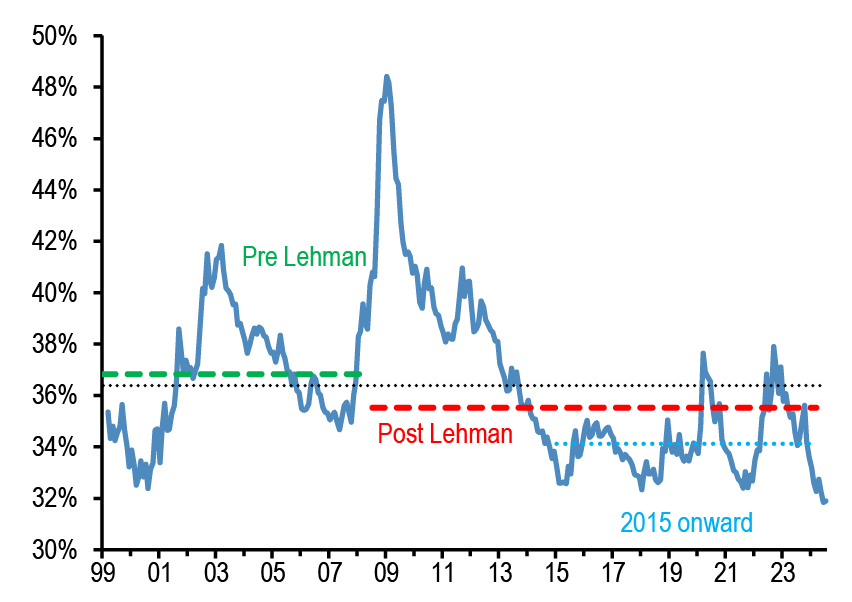
- Our implied equity allocation of non-bank investors globally has risen to its previous October 2007 peak at the same time as the implied cash allocation breached its previous historical low of August 2000.
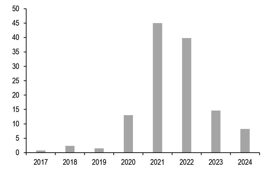
- Our net flow estimate into digital assets YTD decreases to $8bn.
- With the first half of the year behind us, and following the update to our global bond supply-demand balance last week, we revisit our analysis for equities.
- Starting with supply, we noted earlier this year (F&L, Apr 3rd) that the global equity supply picture looked to have turned more negative in the first three months of the year amid a continued softness in IPO markets despite the ongoing strength in equity markets. Indeed, we noted that the elevated macro, geopolitical and policy uncertainty continue to hold back IPOs and this looked unlikely to change any time soon. One simple way to gauge net equity supply is to look at the change in the free float of the global equity universe as captured by tradable indices such as the MSCI AC World index. Adjusted for price and FX changes, this change in the free float should capture the increase or decrease in the quantity of shares available to markets in each period.
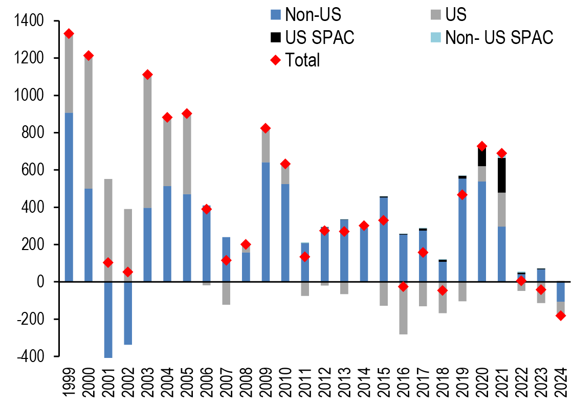
- This proxy is shown in Figure 1 below, which suggests that global equity supply has continued to shift in a more negative direction this year. The current level of around -$180bn is the most negative level in our sample since 1999, and while negative net supply in the US has been a common occurrence over the past decade or so, non-US supply looks to have been negative for the first time since 2002. This negative supply has undoubtedly provided background support for equity markets from a supply perspective, and it looks likely to continue. On an annualized basis, this would imply net supply of -$360bn after net supply of -40bn in 2023, or a decline in supply of $320bn in 2024 vs. 2023.
Figure 1: Net equity supply globally
$bn per year based on the share count/divisor change of the MSCI AC World, adjusted for price and FX changes. 2024 YTD is up to Jul 9th.
Source: Bloomberg Finance L.P., LSEG, J.P. Morgan.
- Turning to equity demand from institutional investors, in our equity demand-supply analysis from end-2023 we had argued that while the severe de-risking by institutional investors in 2022 had created ample space for them to propagate equity markets in 2023 simply through mean reversion, the increase in equity allocations during 2023 had effectively exhausted this reversion to mean. Since the turn of the year, we have been noting a continued increase in equity allocations. The equity positions of institutional investors are based on a combination of their exposure in cash and other derivative markets. Therefore, looking at our positioning metrics based on equity futures provides one way of gauging the change in positioning by institutional investors. An alternative way of estimating the change in equity demand by institutional investors is to look at their equity betas.
- The equity betas of CTAs, Equity Long/Short hedge funds and Balanced Mutual funds are shown in Figure 2 to Figure 5. Starting with Equity Long/Short hedge funds, the biggest equity hedge fund sector with an AUM of $1.2tr, we proxy the equity beta of Equity L/S by looking at futures positions of asset managers and leveraged funds ( Figure 2) as Equity L/S uses futures as an overlay to achieve their desired beta. These futures positions of asset managers and leveraged funds are in turn proxied by the z-score of net CFTC positions as a % of open interest shown in Figure 2 and Chart A13 in the Appendix. A neutral z-score of zero is assumed to correspond to a historical average equity beta of 0.5 for Equity L/S hedge funds. We also assume that a very extreme 3 stdevs move in the z-score of CFTC futures positions corresponds to a very extreme 0.5 change in the equity beta. Using these assumptions, last year had seen a rise in the equity beta from 0.2 in late 2022 to around 0.6 in late 2023. A simple reversion to mean of 0.5 would imply net sales of equity around $180bn for this year, or a deterioration in net demand of around $1tr in 2024 vs. 2023 given the strength of demand last year. That said, as Figure 2 shows, the net longs of asset managers and leveraged funds as a % of open interest recently rose to their highest levels in a decade, suggesting increased equity positions that have supported equities in 1H24 but also imply a larger decline into year-end assuming simple mean reversion.
Figure 2: Positions in US equity futures by Asset managers and Leveraged funds
CFTC positions in US equity futures by Leveraged funds and Asset managers (as a % of open interest). It is an aggregate of the S&P500, Dow Jones, NASDAQ and their Mini futures contracts.
Source: CFTC, Bloomberg Finance L.P., J.P. Morgan.
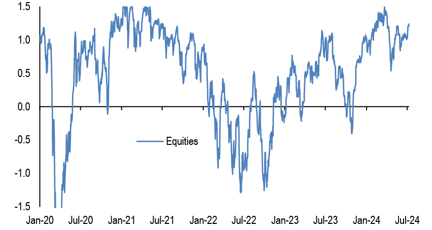
- What about momentum-based investors such as CTAs? Figure 3 shows the average z-score of the short and long lookback period momentum signals for the S&P, Nikkei, Eurostoxx 50, FTSE 100 and MSCI EM indices. This z-score rose from a relatively low level of close to 0.2 in end-2022 to 0.7 by late 2023. Assuming some reversion to its average in recent years of 0.5, this implies a deterioration in demand in 2024 relative to 2023 of around $140bn. But similar to the picture for Equity L/S above, the z-score has risen YTD to around 1.2 currently, which in turn implies that the equity flow of momentum-based investors has been supportive for equities in 1H24 and that this represents a greater headwind for 2H24 assuming mean reversion.
Figure 3: Weighted average of the z scores of equity index momentum signals
z-score of the momentum signals in our Trend Following Strategy framework shown in Tables A3 and A4 in the Appendix. The line shows the average z-score of the short and long lookback period momentum signals for the S&P 500, Nikkei, EuroStoxx50, FTSE100 and MSCI EM indices. We attach 50% weight on the S&P500 momentum signals and 50% weight on the momentum signals of the remaining four indices combined.
Source: CFTC, Bloomberg Finance L.P., J.P. Morgan.
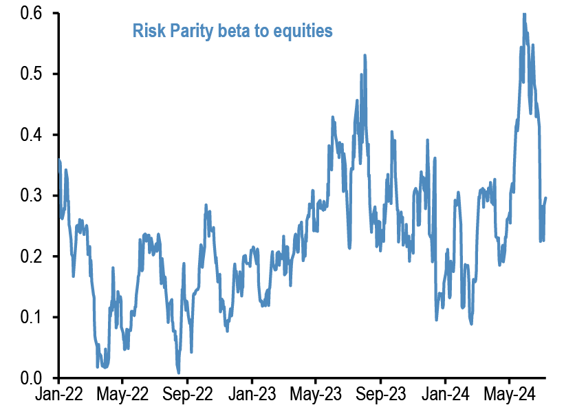
- What about the $150bn universe of risk parity funds? Our calculations suggest that the partial beta of risk parity fund returns to equity returns had effectively doubled from 0.16 in late 2022 to 0.32 in late 2023, which implied an improvement in equity demand of around $80bn in 2023 vs. 2022. Assuming mean reversion to its longer-term average of around 0.25, this would imply a shift from net buying of around $50bn in 2023 to net selling of just under £30bn, or a deterioration in equity demand of just under $80bn.
Figure 4: Equity beta of Risk Parity funds
Rolling 21-day equity beta based on a bivariate regression of the daily returns of our Risk Parity fund return index to the daily returns of the S&P 500 and Bloomberg US Agg indices.
Source: Bloomberg Finance L.P., J.P. Morgan.
- We do a similar calculation for the much larger $7tr universe of Hybrid Mutual funds including Balanced Mutual funds. As we noted previously, 2023 saw an improvement in demand vs. 2022 of around $790bn as the beta rose from 0.54 in late 2022 to 0.61 in late 2023. For 2024, we still project mean reversion to its long-term average of around 0.6, which implies a net deterioration in demand in 2024 vs. 2023 of around $460bn.
- What about pension funds and insurance companies? G4 insurance companies and pension funds, including both defined benefit and defined contribution plans, have typically been steady sellers of equities due to their structural shift away from equities towards fixed income. 2023 saw net sales reaching nearly $470bn, a deterioration in equity demand of around $125bn in 2023 vs. 2022. Given the strength in equity prices and the improvement in the funded status of defined benefit pension funds, we projected unchanged bond demand in 2024 vs. 2023 as the incentive to lock in gains remains and as it has taken somewhat longer for rebalancing flows to materialise than we had expected, and we similarly project unchanged net selling of equities in 2024 vs. 2023.
- Central banks and SWFs saw some moderation in equity purchases in 2023 vs. 2022. Based on some moderation in current account balances of oil producing countries in 2024 vs. 2023, and our commodity strategists’ forecast for Brent prices averaging $84/bbl in 2024 vs. an average of $82/bbl in 2023, we estimate a modest $25bn deterioration of demand in 2024 vs. 2023.
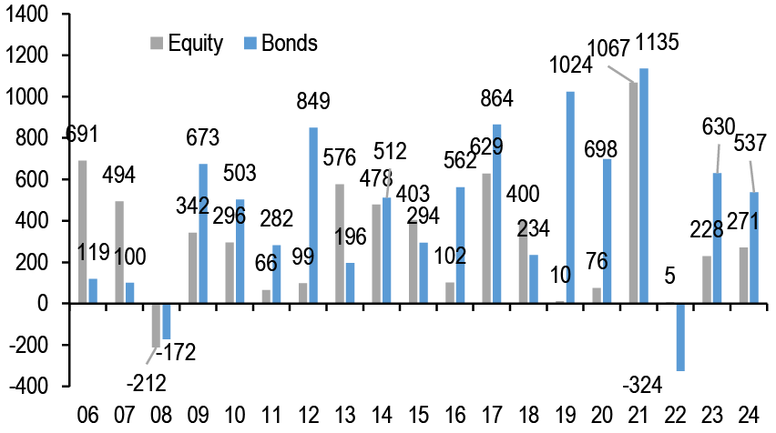
- What about retail investor demand? Last year had seen a return from close to zero net equity fund flows to inflows of around $230bn (Chart A1 in the Appendix), or an improvement of around $225bn, as the 4Q23 flows once quarterly reporting funds are included showed a sharp increase after modest inflows in for the first three quarters of the year. Thus far in 2024, equity funds including ETFs and mutual funds have seen net inflows of around $270bn with 1Q24 seeing particularly strong inflows, and similar to our Bond supply-demand update last week we assume 2H24 flows continue at the 2Q24 pace. This $440bn net inflow would represent a net improvement in bond demand of around $210bn, with inflows somewhat front-loaded in 1Q.
- Where does this leave us for this year’s overall equity demand-supply balance? Assuming mean reversion in equity betas of institutional investors, as well as continued flows into equity ETFs and mutual funds from retail investors and the projected negative net supply, we come up with an equity demand/supply deterioration of around $1.2tr ( Figure 5). Taken at face value, this negative demand-supply balance stands at odds with the rally in equities YTD. However, this assumes mean reversion in the equity betas of institutional investors, while as we note above the equity betas have if anything increased YTD for CTAs and Equity L/S investors in particular. Given these elevated betas, as well as the rather high equity allocation and low cash allocation of global non-bank investors we highlight below, this suggests a material headwind for equities in 2H24.
Figure 5: Annual Change in Global Equity Demand/Supply Balance
Change in flows per year in $bn.
| Year | 2022 vs. 2021 | 2023 vs. 2022 | 2024 vs 2023 |
| Demand | |||
| Retail investors | -1062 | 223 | 209 |
| CTAs | 32 | 184 | -140 |
| Equity L/S | -1474 | 2054 | -1019 |
| Risk Parity Funds |
0 | 79 | -80 |
| Balanced MF | -305 | 789 | -456 |
| Pension & Insurance Funds |
258 | -125 | 0 |
| SWF/ Central banks |
355 | -309 | -25 |
| Total Demand |
-2196 | 2895 | -1511 |
| Supply | -684 | -47 | -322 |
| Demand - Supply |
-1513 | 2942 | -1189 |
Source: J.P. Morgan.
Our implied equity allocation of non-bank investors globally has risen to its previous October 2007 peak at the same time as the implied cash allocation breached its previous historical low of August 2000
- The relentless rally in US equities has expanded the stock of equities by so much, that our measure of the cash allocation by non-bank investors globally (which is proxied by the stock of M2 money supply divided by the stock of equities and bonds held outside banks), made a new historical low (at least since our data begin in 1999 as shown in Figure 6). In particular, the current cash allocation of 31.9% is lower than its previous historical low seen in August 2000 at 32.4%.
Figure 6: Implied cash allocation by non-bank investors globally
Global cash held by non-bank investors as % total holdings of equities/bonds/M2 bynon-bank investors. Dotted lines are averages.
Source: Bloomberg Finance L.P., J.P. Morgan.
- The mirror image of the record low cash allocation has been an increase in the implied equity allocation which at 49% currently is almost equal to the previous peak of 49.6% seen in October 2007 ( Figure 7).
- Given that global non-bank investors cash allocations are at historical low at the same as cash yields are at multi year highs, and given equity allocations are as high as they were at the peak of the 2007 cycle, we believe there is no much of a liquidity buffer to propagate financial assets from here or to absorb negative shocks, thus posing vulnerability to equity markets going forward.
Figure 7: Implied equity allocation by non-bank investors globally
Global equities as % total holdings of equities/bonds/M2 by non-bank investors.Dotted lines are averages.

Source: Bloomberg Finance L.P., J.P. Morgan.
Our net flow estimate into digital assets YTD decreases to $8bn
- We had previously estimated a net flow into digital assets of $12bn by June 12th. This estimate was based on
1. the net inflow into crypto funds is $14.6bn by 12th June.
2. plus the flow impulse implied by CME futures of $5.1bn.
3. plus the fundraising by crypto venture capital funds of $4.9bn
4. minus a $13bn adjustment for the rotation away from digital wallets on exchanges to the new spot bitcoin ETFs. This is due to the cost effectiveness, deeper liquidity, regulatory protection and convenience of the ETF wrapper that has become market participant's preferred choice of instrument for bitcoin exposure for both existing and new crypto investors. This rotation away from digital wallets on exchanges was proxied by the decline in bitcoin reserves across exchanges which by June 12th was estimated by CryptoQuant at 0.22mn bitcoins or $13bn cumulatively since the ETF launch on January 10th.
- Updating these estimates to date results to a lower net flow of $8bn comprised of
1. the net inflow into crypto funds is $14bn by 9th July.
2. plus a flow impulse implied by CME futures of $5bn again to July 9th
3. plus the YTD fundraising by crypto venture capital funds of $5.7bn
4. minus a $17bn adjustment for the rotation away from digital wallets on exchanges to the new spot bitcoin ETFs. Again this is proxied by the decline in bitcoin reserves across exchanges which by July 9th was estimated by CryptoQuant at 0.29mn bitcoins or $17bn.
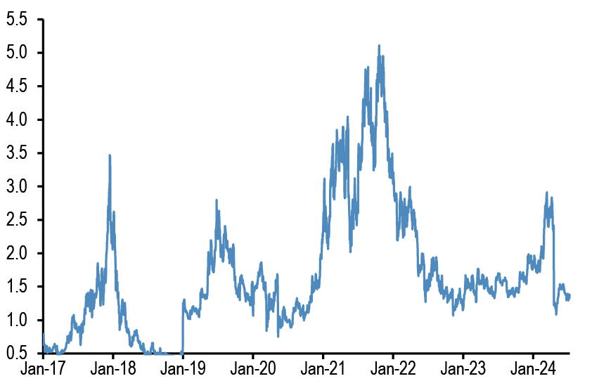
- In other words our net flow estimate into digital assets YTD is decreased from $12bn to $8bn in only a month ( Figure 8). We were skeptical that the $12bn previously estimated to June 12th would continue into the remainder of the year given how high bitcoin prices were relative to bitcoin production cost or relative to gold. We have however surprised by how quickly this net flow has declined.
- That said, the reduction in the estimated net flow is largely driven by the decline in bitcoin reserves across exchanges over the past month which in turn is likely to reflect bitcoin liquidations by Gemini creditors, or Mt. Gox creditors or the German government (in recent weeks the German government has been offloading bitcoins that were previously seized in criminal activities).
- We believe that these liquidations will subside after July and we thus continue to look for a crypto market rebound from August onwards.
Figure 8: Total net flow into digital assets by year
$bn per year including crypto fund flows, the flow impulse implied by CME futures and crypto VC fundraising
Source: Bloomberg Finance L.P., Messari,, Defilama, J.P. Morgan.
Appendix
Chart A1: Global equity & bond fund flows
$bn per year of Net Sales, i.e. includes net new sales + reinvested dividends for Mutual Funds and ETFs globally, i.e. for funds domiciled both inside and outside the US. Flows come from ICI (worldwide data up to Q1’24). Data since then are a combination of monthly and weekly data from Lipper, EPFR and ETF flows from Bloomberg Finance L.P.
Source: ICI, EPFR, Lipper, Bloomberg Finance L.P., J.P. Morgan.
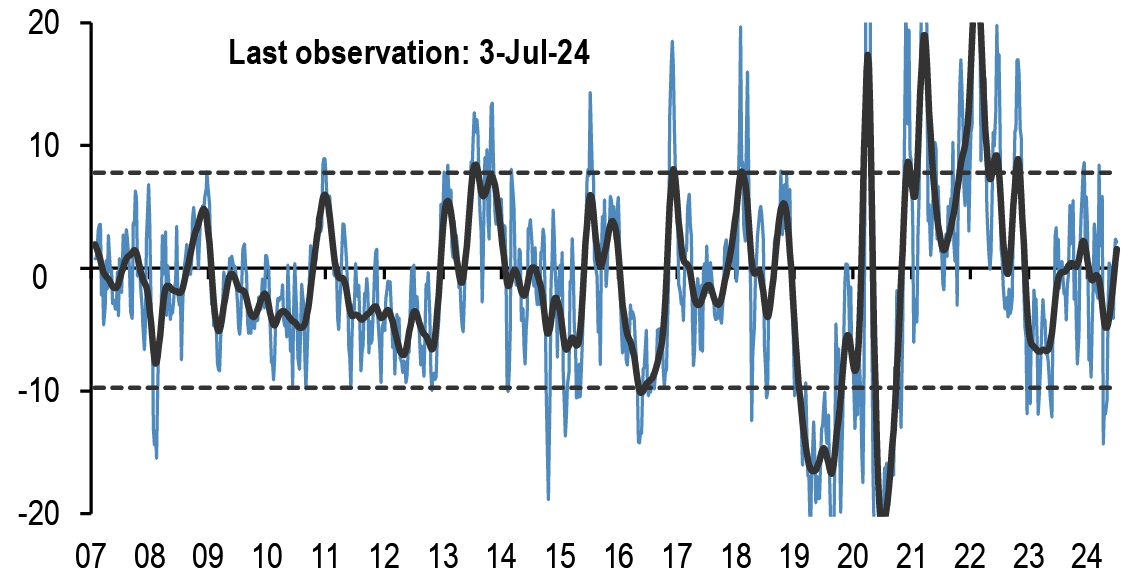
Chart A2: Fund flow indicator
Difference between flows into Equity and Bond funds: $bn per week. Difference between flows into Equity vs. Bond funds in $bn per week. Flows include Mutual Fund and ETF flows globally, i.e. funds domiciled both inside and outside the US (source: EPFR) The thin blue line shows the 4-week average of difference between Equity and Bond fund flows. Dotted lines depict ±1 StDev of the blue line. The thick black line shows a smoothed version of the same series. The smoothing is done using a Hodrick-Prescott filter with a Lambda parameter of 100.
Source: EPFR, J.P. Morgan.
Table A1: Flow Monitor
$bn per week. The first two rows include Mutual Fund and ETF flows globally, i.e.flows for funds domiciled both inside and outside the US(source: EPFR). The last four rows only include funds domiciled in the US.International Equity funds are equity funds domiciled in the US that invest outside the US (source: ICI and Bloomberg Finance L.P.).
| MF & ETF Flows | 3-Jul | 4 wk avg | 13 wk avg | 2024 avg |
| All Equity | 10.89 | 12.9 | 6.6 | 8.6 |
| All Bond | 19.04 | 10.8 | 10.5 | 11.0 |
| US Equity | -2.53 | -0.3 | -5.2 | -4.4 |
| US Bonds | 7.88 | 3.1 | 3.9 | 7.1 |
| Non-US Equity | 13.43 | 13.2 | 11.8 | 13.0 |
| Non-US Bonds | 11.16 | 7.6 | 6.6 | 3.9 |
| US Taxable Bonds | 5.54 | 5.0 | 4.7 | 4.3 |
| US Municipal Bonds | -0.12 | -0.1 | 0.1 | 0.0 |
| US HG Bonds | 3.38 | 2.2 | 2.1 | 4.0 |
| US HY Bonds | -0.09 | -0.3 | 0.4 | 0.4 |
| US MMFs | 25.95 | 12.2 | -0.1 | 9.6 |
| UCITS Flows | Apr-24 | 3 mth avg | 2023 avg | 2024 avg |
| Euro MMFs | 15.04 | 1.23 | 15.63 | 8.36 |
| Euro Equities | -1.49 | 3.4 | 0.6 | 2.5 |
| Euro Bonds | 28.26 | 28.4 | 12.3 | 30.0 |
Source: ICI, EPFR, EFAMA, Bloomberg Finance L.P., and J.P. Morgan.
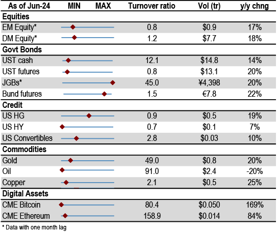
Table A2: Trading turnover monitor
Volumes are monthly and Turnover ratio is annualised (monthly trading volume annualised divided by the amount outstanding). UST Cash is primary dealer transactions in all US government securities. UST futures are from Bloomberg Finance L.P. JGBs are OTC volumes in all Japanese government securities. Bunds, Gold, Oil and Copper are futures. Gold includes Gold ETFs. Min-Max chart is based on Turnover ratio. For Bunds and Commodities, futures trading volumes are used while the outstanding amount is proxied by open interest. The diamond reflects the latest turnover observation. The thin blue line marks the distance between the min and max for the complete time series since Jan-2005 onwards. Y/Y change is change in YTD notional volumes over the same period last year.
Source: Bloomberg Finance L.P., Federal Reserve, Trace, Japan Securities Dealer Association, WFE, J.P. Morgan.
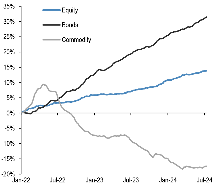
ETF Flow Monitor (as of 10th July)
Chart A3: Global Cross Asset ETF Flows
Cumulative flow into ETFs as a % of AUM
Source: Bloomberg Finance L.P., J.P. Morgan.
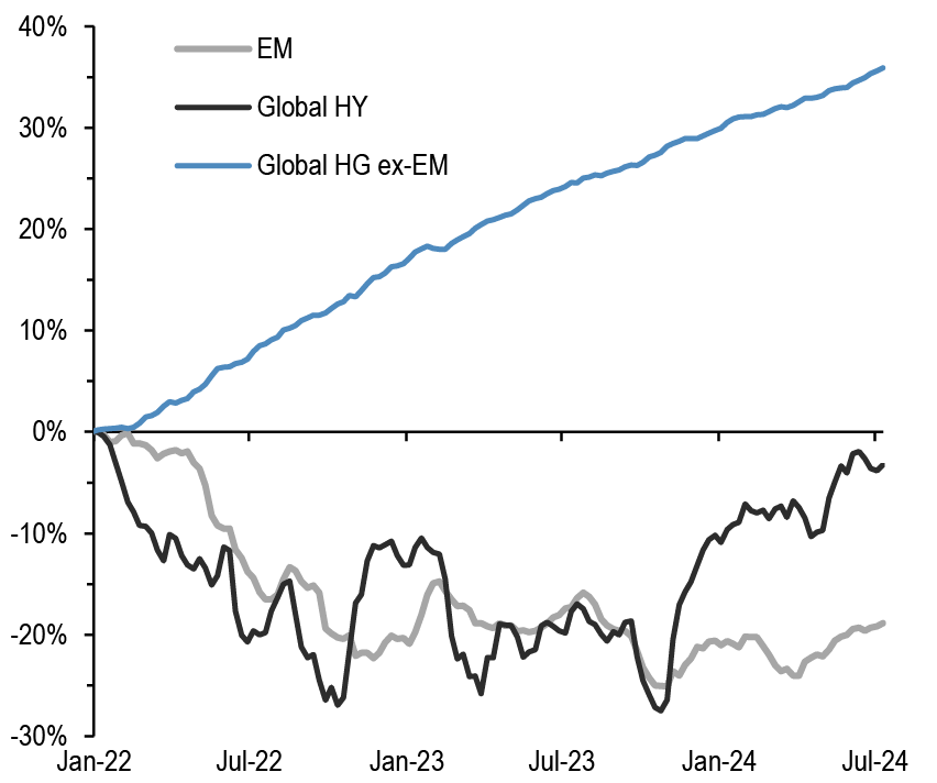
Chart A4: Bond ETF Flows
Cumulative flow into bond ETFs as a % of AUM
Source: Bloomberg Finance L.P., J.P. Morgan.
Chart A5: Global Equity ETF Flows
Cumulative flow into global equity ETFs as a % of AUM
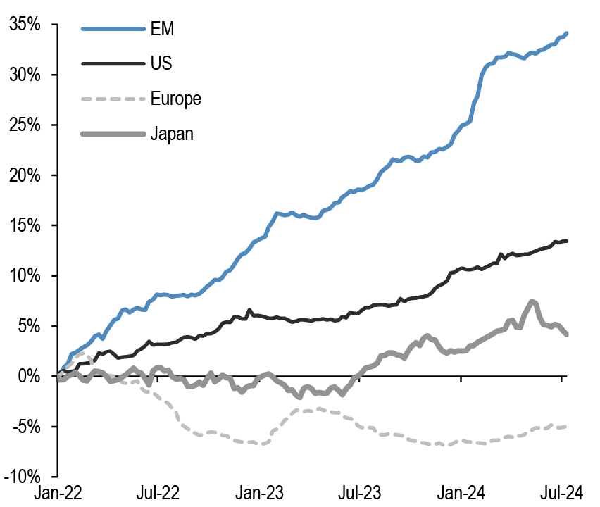
Source: Bloomberg Finance L.P., J.P. Morgan. Note: We include ETFs with AUM > $200mn in all the flow monitor charts. Chart A5 exclude China On-shore (A-share) ETFs from EM and in Japan. We subtract the BoJ buying of ETFs.
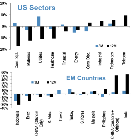
Chart A6: Equity Sectoral and Regional ETF Flows
Rolling 3-month and 12-month change in cumulative flows as a % of AUM. Both sorted by 12-month change
Source: Bloomberg Finance L.P., J.P. Morgan.
Short Interest Monitor
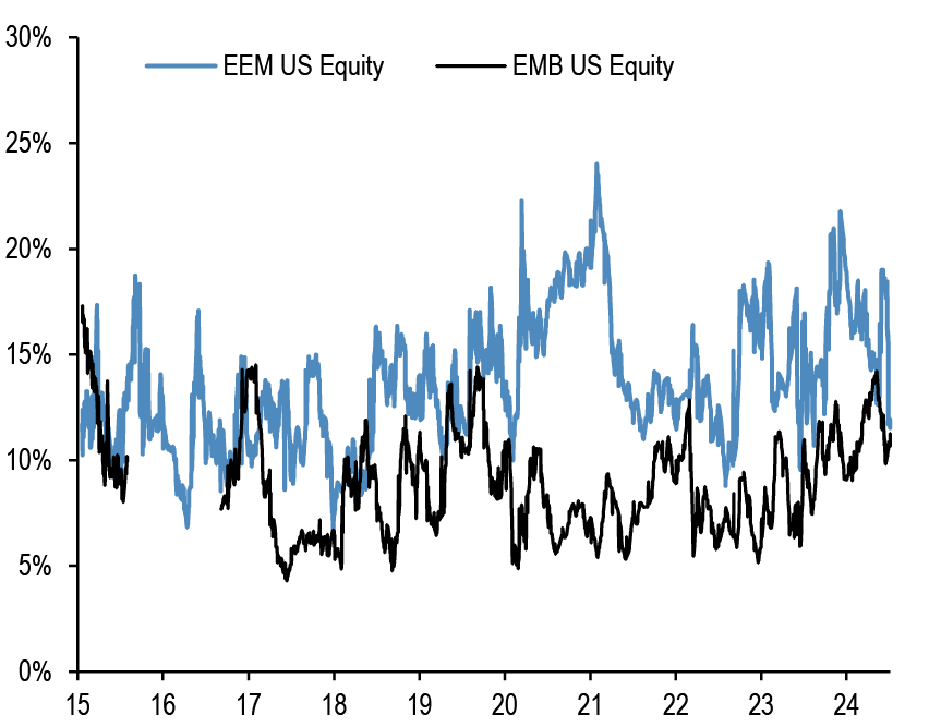
Chart A7: Short interest on the EEM and EMB US ETF
Short Interest as a % share of share outstanding.
Source: S3, J.P. Morgan
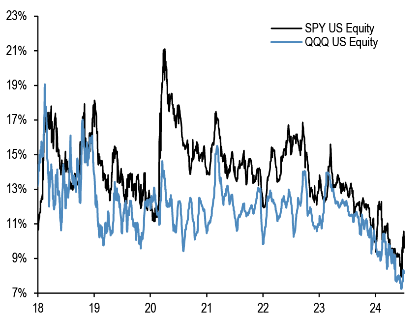
Chart A9: Short interest on the SPY and QQQ US ETF
Short Interest as a % share of share outstanding. Last obs is for 1st July 2024.
Source: S3, J.P. Morgan
Chart A8: Short interest on the LQD and HYG US ETF
Short Interest as a % share of share outstanding.

Source: S3, J.P. Morgan
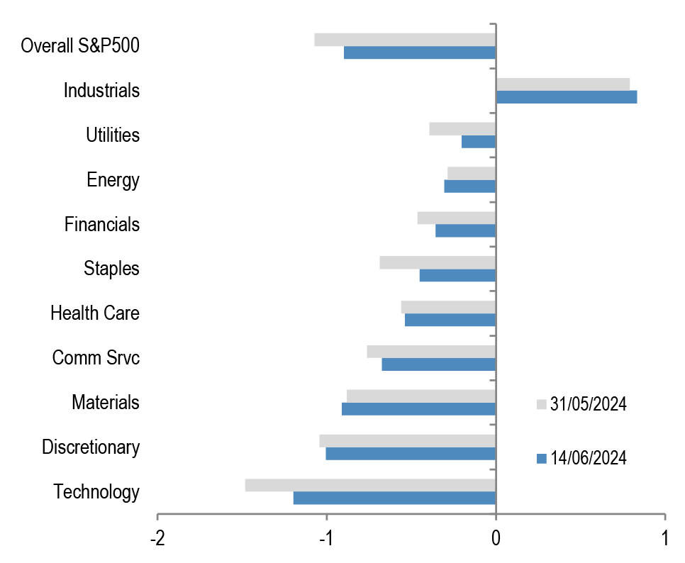
Chart A10: S&P500 sector short interest
Short interest as a % of shares outstanding based on z-scores. A strategy which overweights the S&P500 sectors with the highest short interest z-score (as % of shares o/s) vs. those with the lowest, produced an information ratio of 0.7 with a success rate of 56% (see F&L, Jun 28,2013 for more details).
Source: NYSE, Bloomberg Finance L.P., J.P. Morgan
Chart A11a: Cross Asset Volatility Monitor 3m ATM Implied Volatility (1y history) as of 1st July-2024
This table shows the richness/cheapness of current three-month implied volatility levels (red dot) against their one-year historical range (thin blue bar) and the ratio to current realised volatility. Assets with implied volatility outside their 25th/75th percentile range (thick blue bar) are highlighted. The implied-to-realised volatility ratio uses 3-month implied volatilities and 1-month (around 21 trading days) realised volatilities for each asset.


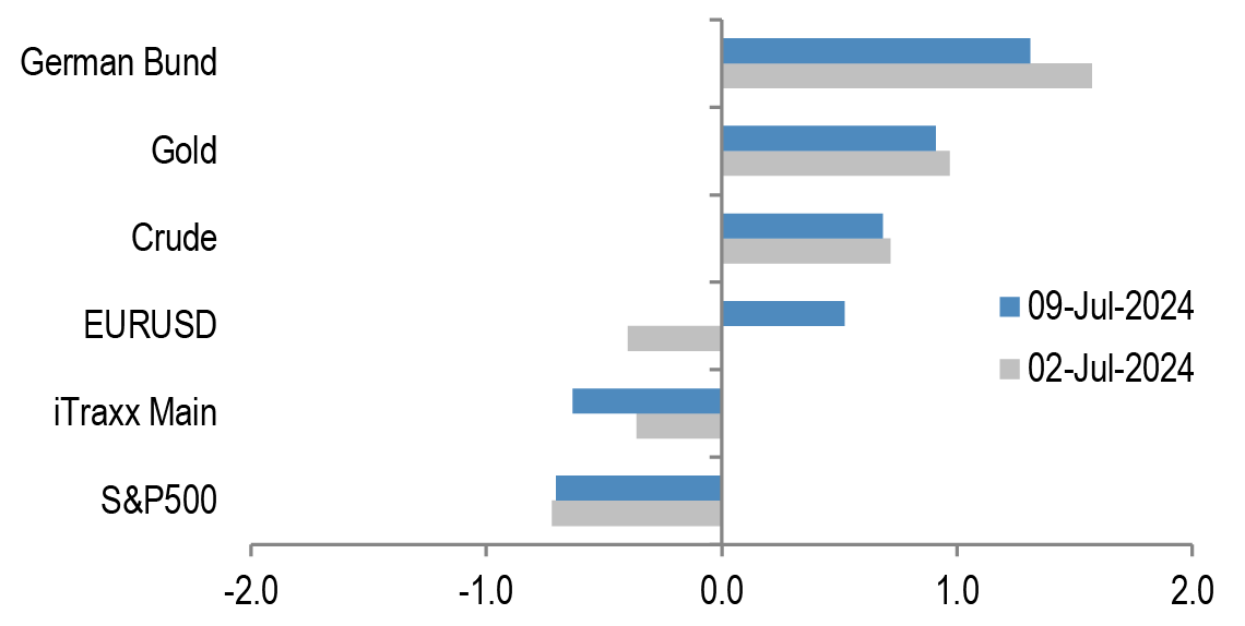
Chart A11b: Option skew monitor
Skew is the difference between the implied volatility of out-of-the-money (OTM) call options and put options. A positive skew implies more demand for calls than puts and a negative skew, higher demand for puts than calls. It can therefore be seen as an indicator of risk perception in that a highly negative skew inequities is indicative of a bearish view. The chart shows z-score of the skew, i.e. the skew minus a rolling 2-year avg skew divided by a rolling two-year standard deviation of the skew. A negative skew on iTraxx Main means investors favour buying protection, i.e. a short risk position. A positive skew for the Bund reflects a long duration view, also a short risk position.
Source: J.P. Morgan.
Chart A11c: Equity-Bond metric map
Explanation of Equity - Bond metric map: Each of the five axes corresponds to a key indicator for markets. The position of the blue line on each axis shows how far the current observation is from the extremes at either end of the scale. For example, a reading at the centre for value would mean that risky assets are the most expensive they have ever been while a reading at the other end of the axis would mean they are the cheapest they have ever been. Overall, the larger the blue area within the pentagon, the better for the risky markets. All variables are expressed as the percentile of the distribution that the observation falls into. I.e. a reading in the middle of the axis means that the observation falls exactly at the median of all historical observations. Value: The slope of the risk-return trade-off line calculated across USTs, US HG and HY corporate bonds and US equities(see GMOS p. 6, Loeys et al, Jul 6 2011 for more details). Positions: Difference between net spec positions on US equities and intermediate sector UST. See Chart A13. Flow momentum: The difference between flows into equity funds (incl. ETFs) and flows into bond funds. Chart A1. We then smooth this using a Hodrick-Prescott filter with a lambda parameter of 100. We then take the weekly change in this smoothed series as shown in Chart A1. Economic momentum:The 2-month change in the global manufacturing PMI. (See REVISITING: Using the Global PMI as trading signal, Nikolaos Panigirtzoglou, Jan 2012). Equity price momentum: The 6-month change in the S&P500 equity index. As of 5th July 24.

Source: Bloomberg Finance L.P., J.P. Morgan.
Spec position monitor
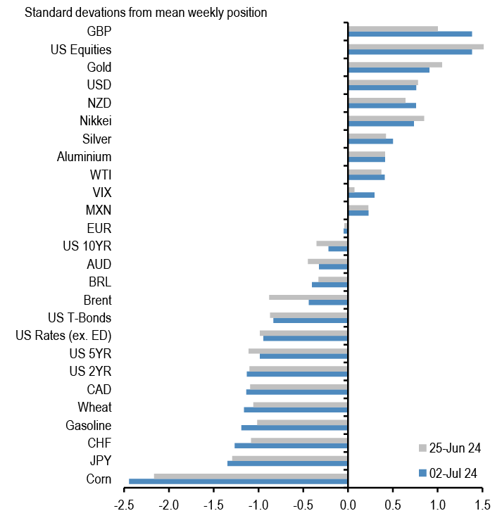
Chart A12: Weekly Spec Position Monitor
Net spec positions are proxied by the number of long contracts minus the number of short contracts using the speculative category of the Commitments of Traders reports (as reported by CFTC). To proxy for speculative investors for equity and US Treasury bond futures positions we use Asset managers and leveraged funds (see Chart A13), whereas for other assets we use the legacy Non-Commercial category. This net position is then converted to a dollar amount by multiplying by the contract size and then the corresponding futures price. We then scale the net positions by open interest. The chart shows the z-score of these net positions. US rates is a duration-weighted composite of the individual UST futures contracts excluding the Eurodollar contract.
Source: Bloomberg Finance L.P., CFTC, J.P. Morgan
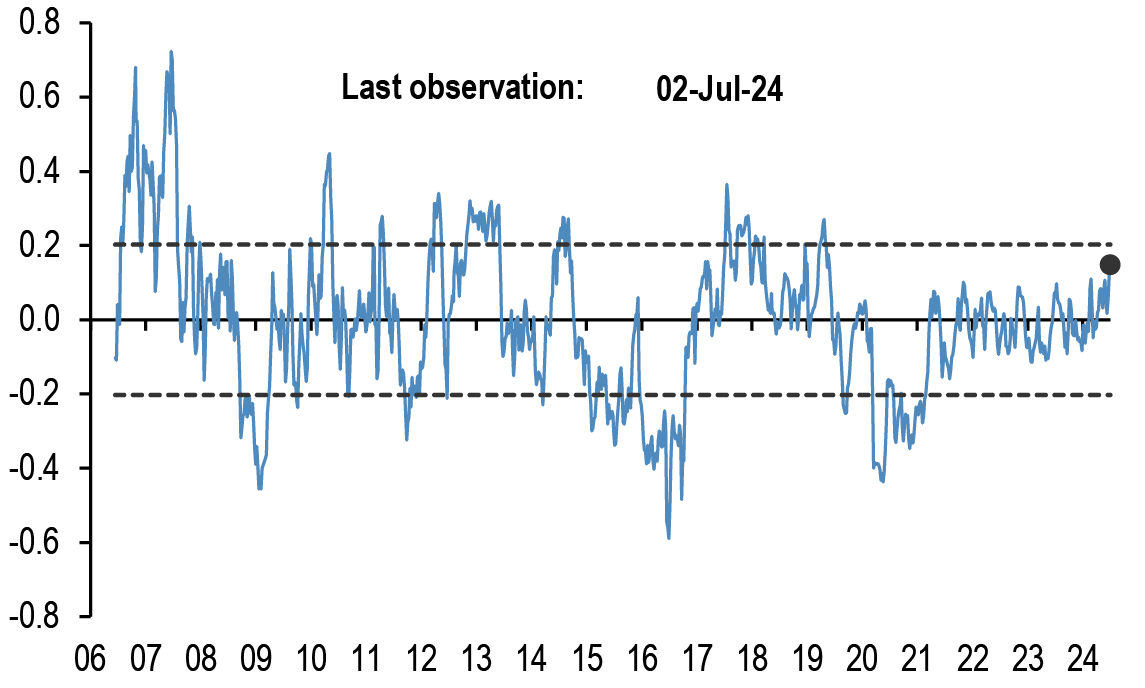
Chart A14: Spec position indicator on Risky vs. Safe currencies
Difference between net spec positions on risky & safe currencies. Net spec position is calculated in USD across 5 ‘risky’ and 3 ‘safe’ currencies (safe currencies also include Gold). These positions are then scaled by open interest and we take an average of ‘risky’ and ‘safe’ assets to create two series. The chart is then simply the difference between the“risky” and “safe” series. The final series shown in the chart below is demeaned using data since 2006. The risky currencies are: AUD, NZD,CAD, MXN and BRL. The safe currencies are: JPY, CHF and Gold.
Source: Bloomberg Finance L.P., CFTC, J.P. Morgan.
Chart A13: Positions in US equity futures by Asset managers and Leveraged funds
CFTC positions in US equity futures by Leveraged funds and Asset managers (as a % of open interest). It is an aggregate of the S&P500, DowJones, NASDAQ and their Mini futures contracts.

Source: CFTC, Bloomberg Finance L.P. and J.P. Morgan
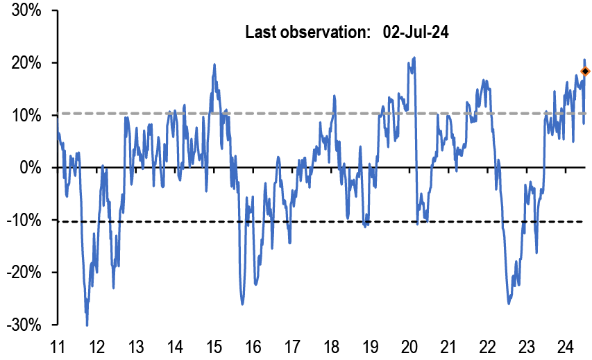
Chart A15: Spec position indicator on US equity futures vs. intermediate sector UST futures
Difference between net spec positions on US equity futures vs.intermediate sector UST futures. This indicator is derived by the difference between total CFTC positions in US equity futures by Asset managers + Leveraged Funds scaled by open interest minus the Asset managers + Leveraged Funds spec position on intermediate sector UST futures (i.e. all UST futures duration weighted ex ED and ex 2Y UST futures) also scaled by open interest.
Source: CFTC, Bloomberg Finance L.P. and J.P. Morgan
Mutual fund and hedge fund betas
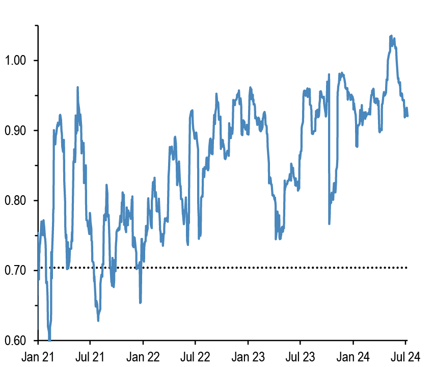
Chart A16: 21-day rolling beta of 20 biggest active US bond mutual fund managers with respect to the US Agg Bond Index
The dotted line shows the average beta since 2013.
Source: Bloomberg Finance L.P., J.P. Morgan.
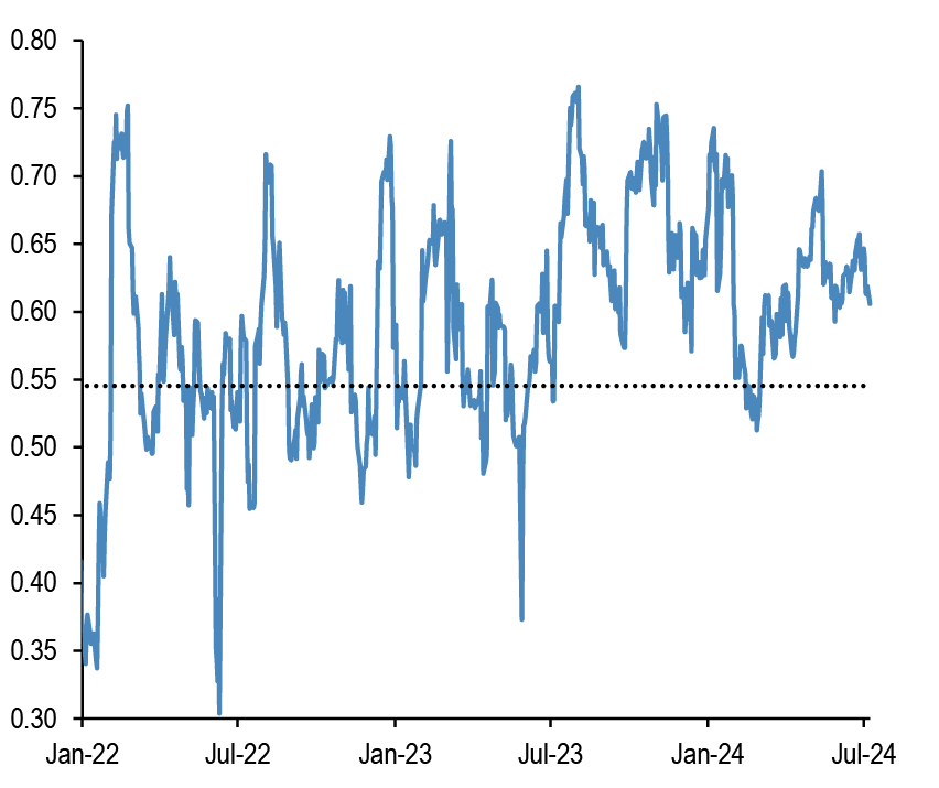
Chart A17: 21-day rolling beta of 20 biggest active Euro bond mutual fund managers with respect to the Euro Agg Bond Index
The dotted line shows the average beta since 2013.
Source: Bloomberg Finance L.P., J.P. Morgan.
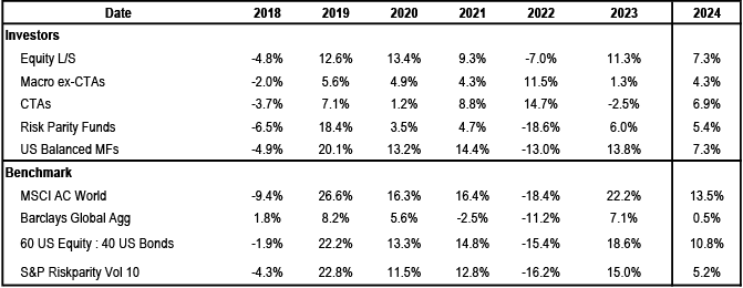
Chart A18: Performance of various type of investors
The table depicts the performance of various types of investors in % as of 8th July 2024.
Source: Bloomberg Finance L.P., HFR, Pivotal Path, J.P. Morgan.
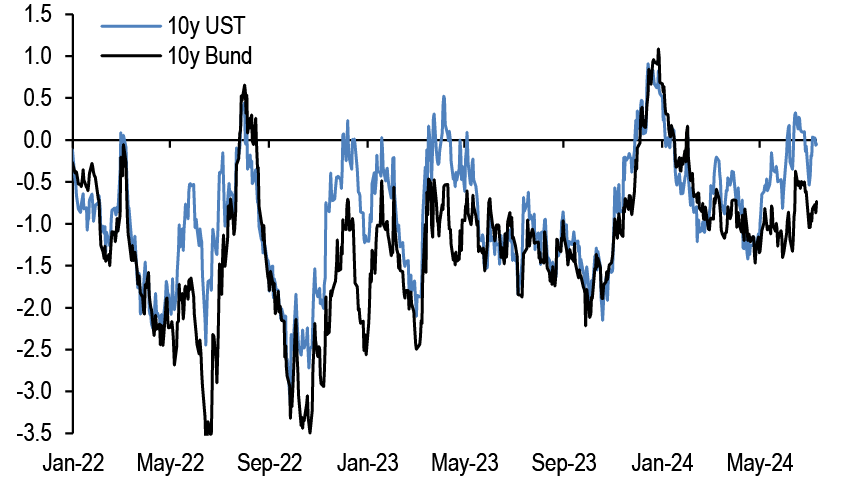
Chart A19: Momentum signals for 10Y UST and 10Y Bunds
Average z-score of Short- and Long-term momentum signal in our Trend Following Strategy framework shown in Tables A3 and A4 below in the Appendix
Source: Bloomberg Finance L.P., J.P. Morgan.
Chart A20: Momentum signals for S&P500
Average z-score of Short- and Long-term momentum signal in our Trend Following Strategy framework shown in Tables A3 and A4 below in the Appendix.

Source: Bloomberg Finance L.P., J.P. Morgan.
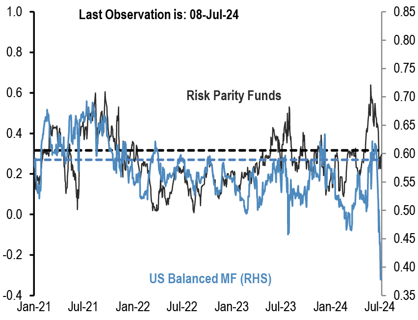
Chart A21: Equity beta of US Balanced Mutual funds and Risk Parity funds
Rolling 21-day equity beta based on a bivariate regression of the daily returns of our Balanced Mutual fund and Risk Parity fund return indices to the daily returns of the S&P 500 and BarCap US Agg indices. Given that these funds invest in both equities and bonds we believe that the bivariate regression will be more suitable for these funds. Our risk parity index consists of 25 daily reporting Risk Parity funds. Our Balanced Mutual fund index includes the top 20 US-based active funds by assets and that have existed since 2006. Our Balanced Mutual fund index has a total AUM of$700bn, which is around half of the total AUM of $1.5tr of US based Balanced funds which we believe to be a good proxy of the overall industry It excludes tracker funds and funds with a low tracking error. Dotted lines are average since 2015.
Source: Bloomberg Finance L.P., J.P. Morgan.
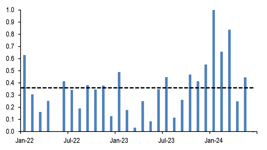
Chart A22: Equity beta of monthly reporting Equity Long/Short hedge funds
Proxied by the ratio of the monthly performance of Pivotal Path Asset-Weighted Equity Hedge fund index divided by the monthly performance of MSCI ACWorld Index.
Source: Bloomberg Finance L.P., Pivotal Path, J.P. Morgan
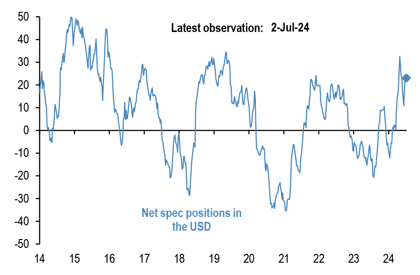
Chart A23: USD exposure of currency hedge funds
The net spec position in the USD as reported by the CFTC. Spec is the non-commercial category from the CFTC.
Source: CFTC, Barclay, Datastream, Bloomberg Finance L.P., J.P. Morgan.
CTAs – Trend following investors’ momentum indicators
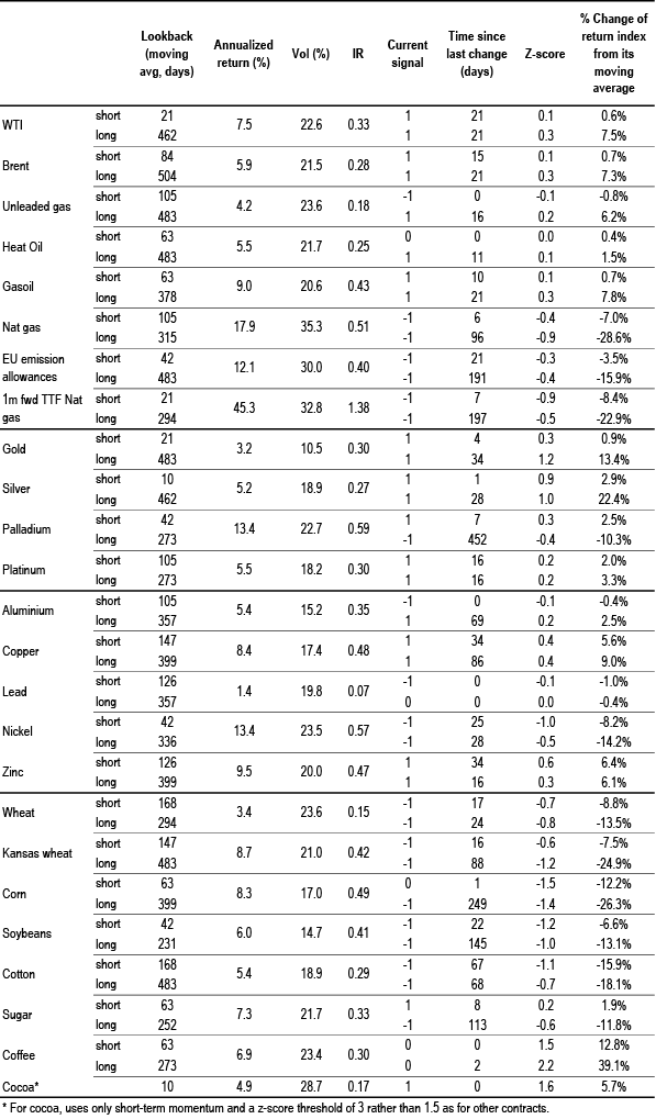
Table A3: Simple return momentum trading rules across various commodities
Optimal lookback period of each momentum strategy combined with a mean reversion indicator that turns signal neutral when momentum z-score more than 1.5 standard deviations above or below mean, and a filter that turns neutral when the z-score is low (below 0.05 and above -0.05) to avoid excessive trading. Lookbacks, current signals and z-scores are shown for shorter-term and longer-term momentum separately, along with performance of a combined signal. Annualized return, volatility and
information ratio of the signal; current signal; and z-score of the current return over the relevant lookback period; data from 1999 onward.
Source: Bloomberg Finance L.P., J.P. Morgan calculations.
Table A4: Simple return momentum trading rules across international equity indices, bond futures and FX
Optimal lookback period of each momentum strategy combined with a mean reversion indicator that turns signal neutral when momentum z-score more than 1.5 standard deviations above or below mean, and a filter that turns neutral when the z-score is low (below 0.05 and above -0.05) to avoid excessive trading. Lookbacks, current signals and z-scores are shown for shorter-term and longer-term momentum separately, along with performance of a combined signal. Annualized return, volatility and
information ratio of the signal; current signal; and z-score of the current return over the relevant lookback period; data from 1999 onward.
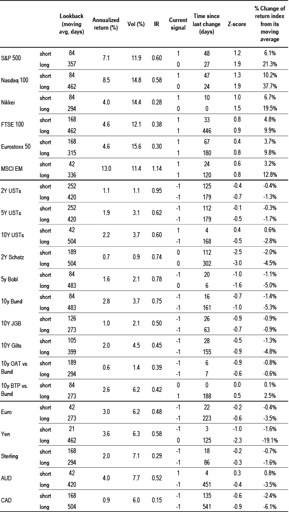
Source: Bloomberg Finance L.P., J.P. Morgan calculations.
Corporate Activity
Chart A24: G4 non-financial corporate capex and cash flow as % of GDP
% of GDP, G4 includes the US, the UK, the Euro area and Japan. Last observation as of Q4 2023.
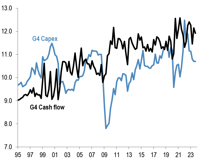
Source: ECB, BOJ, BOE, Federal Reserve flow of funds, J.P. Morgan.
Chart A25: G4 non-financial corporate sector net debt and equity issuance
$tr per quarter, G4 includes the US, the UK, the Euro area and Japan. Last observation as of Q4 2023.
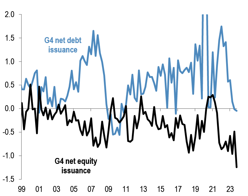
Source: ECB, BOJ, BOE, Federal Reserve flow of funds, J.P. Morgan.
Chart A26: Global M&A and LBO
$tr. M&A and LBOs are announced.
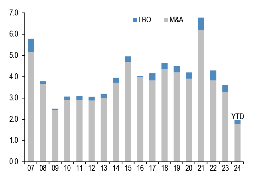
Source: Dealogic, J.P. Morgan.
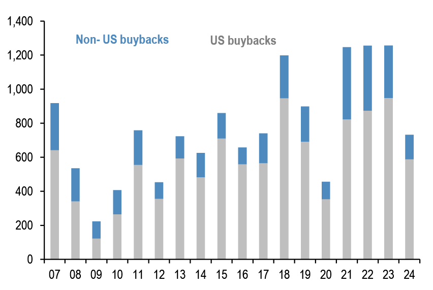
Chart A27: US and non-US share buyback
$bn, are as of June’24. Buybacks are announced.
Source: Bloomberg Finance L.P., Thomson Reuters, J.P. Morgan
Pension fund and insurance company flows
Chart A28: G4 pension funds and insurance companies equity and bond flows
Equity and bond buying in $bn per quarter. G4 includes the US, the UK,Euro area and Japan. Last observation is Q1 2024.

Source: ECB, BOJ, BOE, Federal Reserve flow of funds, J.P. Morgan.
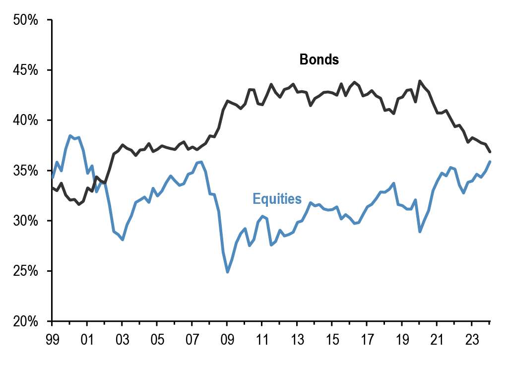
Chart A29: G4 pension funds and insurance companies equity and bond levels
Equity and bond as % of total assets per quarter. G4 includes the US, the UK, Euro area and Japan. Last observation is Q1 2024.
Source: ECB, BOJ, BOE, Federal Reserve flow of funds., J.P. Morgan
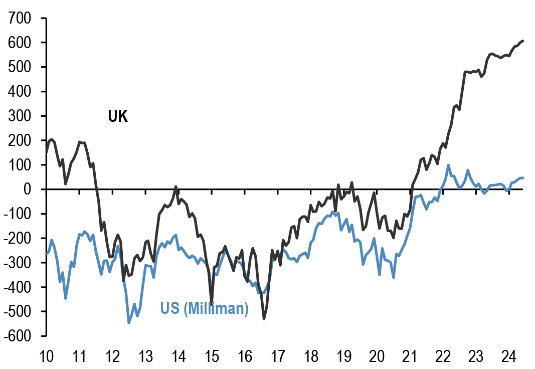
Chart A30: Pension fund deficits
US$bn. For US, funded status of the 100 largest corporate defined benefit pension plans, from Milliman. For UK, funded status of the defined benefit schemes eligible for entry to the Pension Protection Fund, converted to US$at today’s exchange rates.
Last obs. is June’24 for US & UK.
Source: Milliman, UK Pension Protection Fund, J.P. Morgan.
Chart A31: G4 pension funds and insurance companies cash and alternatives levels
Cash and alternative investments as % of total assets per quarter. G4 includes the US, the UK, Euro area and Japan. Last observation is Q1 2024.

Source: ECB, BOJ, BOE, Federal Reserve flow of funds, J.P. Morgan.
Credit Creation
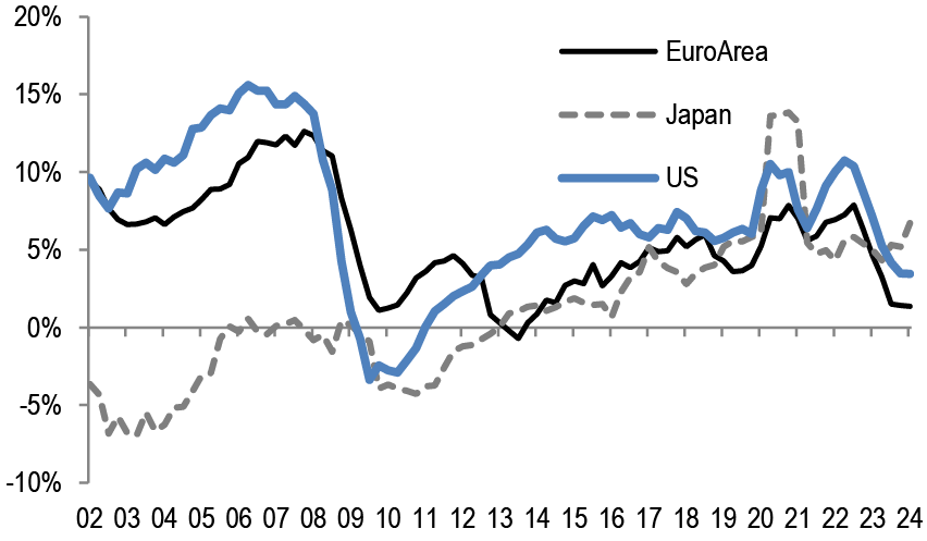
Chart A32: Credit creation in the US, Japan and Euro area
Rolling sum of 4-quarter credit creation as % of GDP. Credit creation includes both bank loans as well as net debt issuance by non-financial corporations and households. Last obs. is Q1’24 for Japan, Euro Area and US.
Source: Fed, ECB, BoJ, Bloomberg Finance L.P., and J.P. Morgan calculations.
Chart A33: Credit creation in EM
Rolling sum of 4-quarter credit creation as % of GDP. Credit creation includes both bank loans as well as net debt issuance by non-financial corporations and households. Last obs. is for Q4’23.
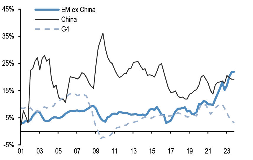
Source: G4 Central banks FoF, BIS, ICI, Barcap, Bloomberg Finance L.P., IMF, and J.P.Morgan calculation
Chart A34: Monthly net issuance of US HG bonds
$bn. May 2024.
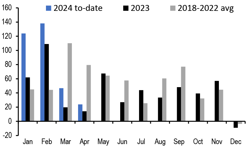
Source: Dealogic, J.P. Morgan
Table A5: Equity and Bond issuance
$bn, Equity supply and corporate announcements are based on announced deals, not completed. M&A is announced deal value and buybacks are announced transactions. Y/Y change is change in YTD announcements over the same period last year.
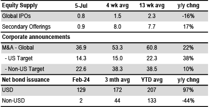
Source: Bloomberg Finance L.P., Dealogic, Thomson Reuters, J.P. Morgan.
Bitcoin monitor
Chart A35: Our Bitcoin position proxy based on open interest in CME Bitcoin futures contracts
In number of contracts. Last obs. for 9th July 2024.
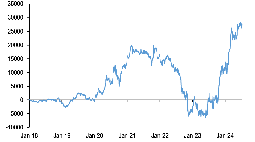
Source: Bloomberg Finance L.P., J.P. Morgan
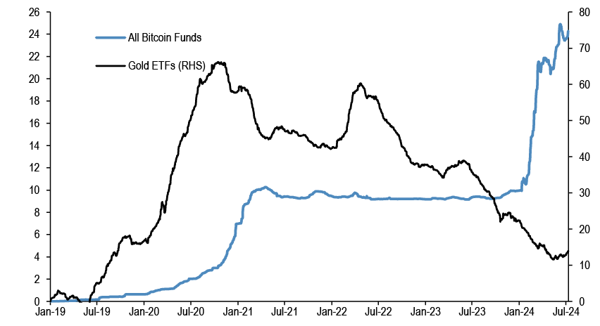
Chart A36: Cumulative Flows in all Bitcoin funds and Gold ETF holdings
Both the y-axis in $bn.
Source: Bloomberg Finance L.P., J.P. Morgan.
Chart A37: Ratio of Bitcoin market price to production cost
Based on the cost of production approach following Hayes (2018).
Source: Bitinfocharts, J.P. Morgan
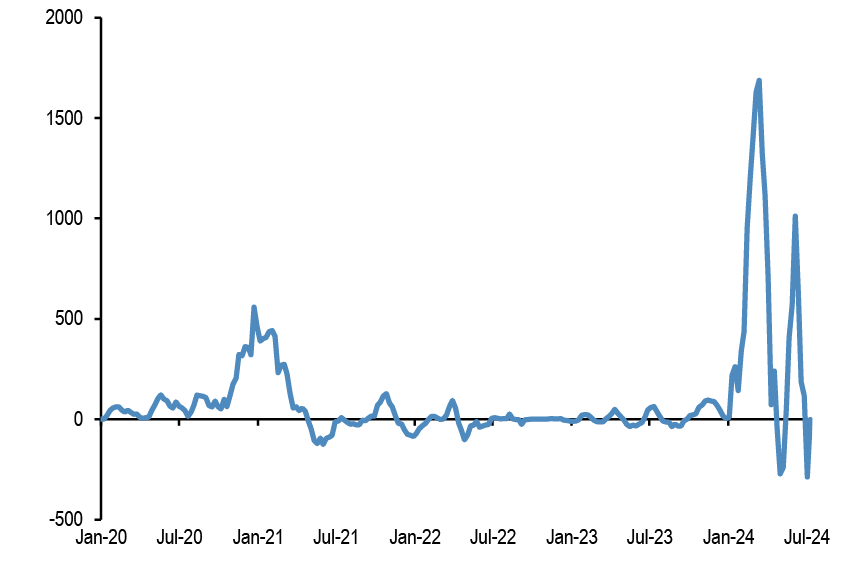
Chart A38: Flow pace into publicly-listed Bitcoin funds including Bitcoin ETFs
$mm per week, 4-week rolling average flow.
Source: Bloomberg Finance L.P., J.P. Morgan.
Japanese flows and positions
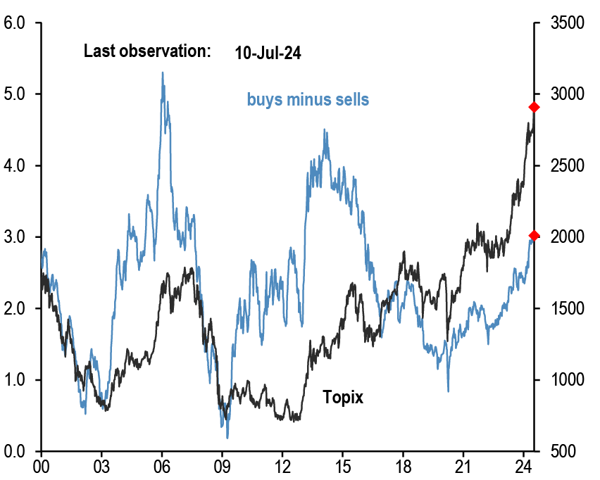
Chart A39: Tokyo Stock Exchange margin trading: total buys minus total sells
In bn of shares. Topix on right axis.
Source: Tokyo Stock Exchange, Bloomberg Finance L.P., J.P. Morgan.
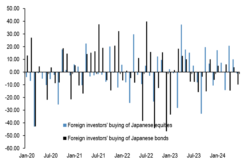
Chart A40: Monthly net purchases of Japanese bonds and Japanese equities by foreign residents
$bn, Last weekly obs. is for 28th June’ 24.
Source: Japan MoF, Bloomberg Finance L.P., and J.P. Morgan.
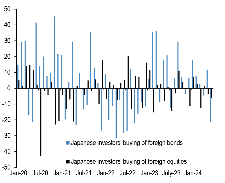
Chart A41: Monthly net purchases of foreign bonds and foreign equities by Japanese residents
$bn, Last weekly obs. is for 28th June’ 24.
Source: Japan MoF, Bloomberg Finance L.P., and J.P. Morgan.
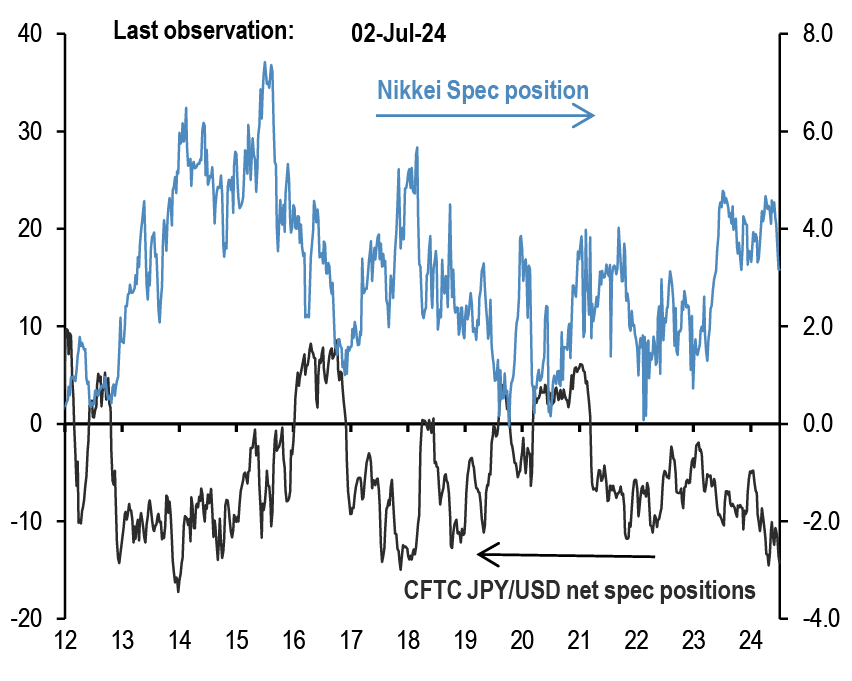
Chart A42: Overseas CFTC spec positions
CFTC spec positions are in $bn. For Nikkei we use CFTC positions in Nikkei futures (USD & JPY) by Leveraged funds and Asset managers.
Source: Bloomberg Finance L.P., CFTC, J.P. Morgan calculations.
Commodity flows and positions
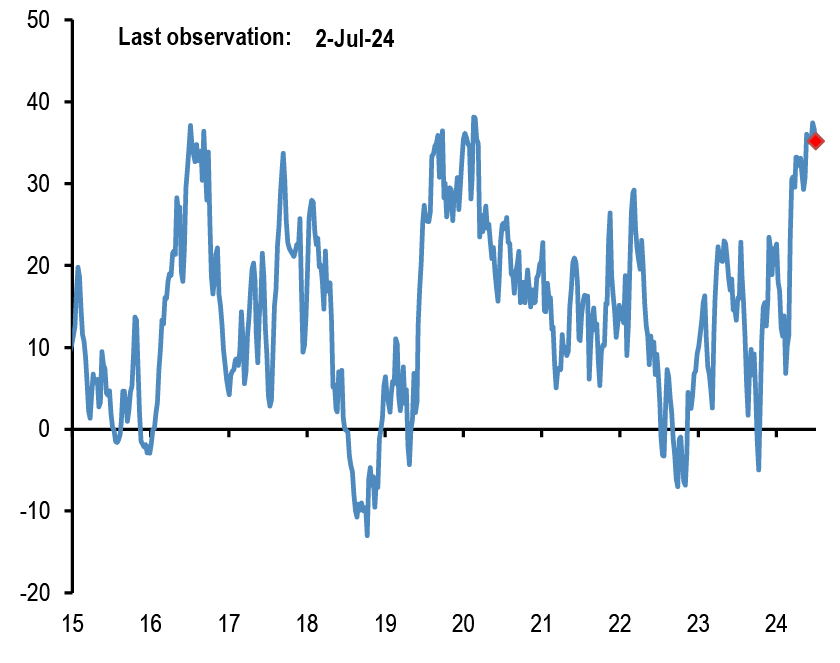
Chart A43: Gold spec positions
$bn. CFTC net long minus short position in futures for the Managed Money category.
Source: CFTC, Bloomberg Finance L.P., J.P. Morgan.
Chart A44: Gold ETFs
Mn troy oz. Physical gold held by all gold ETFs globally.

Source: Bloomberg Finance L.P., J.P. Morgan.
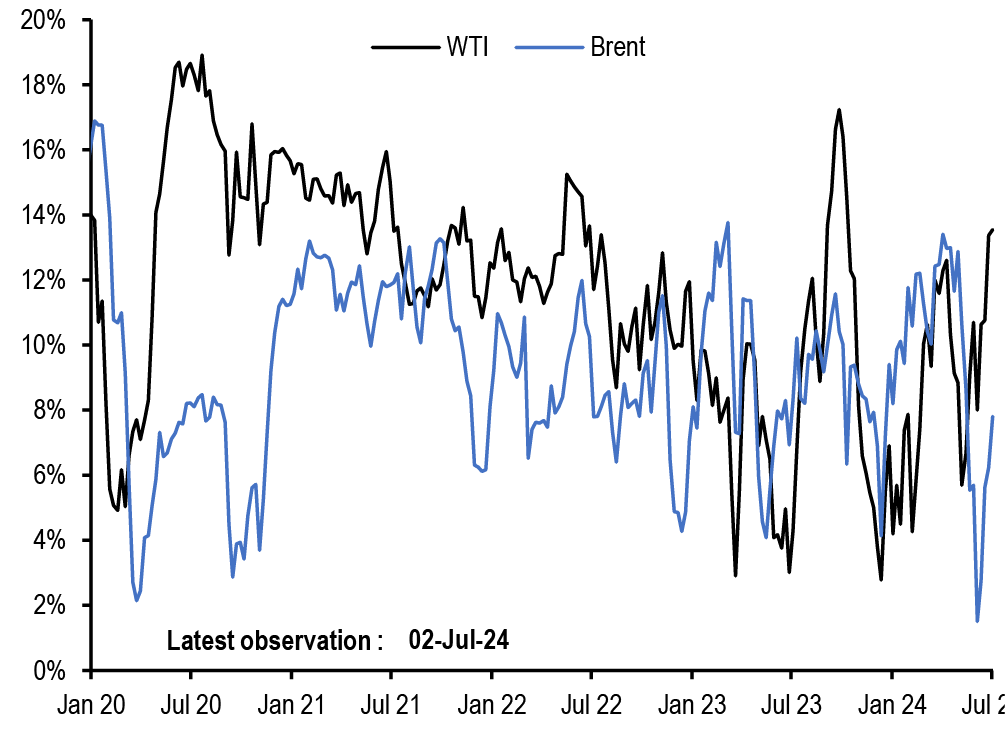
Chart A45: Oil spec positions
Net spec positions divided by open interest. CFTC futures positions for WTI and Brent are net long minus short for the Managed Money category.
Source: CFTC, Bloomberg Finance L.P., J.P. Morgan.
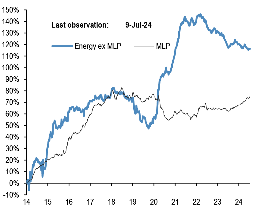
Chart A46: Energy ETF flows
Cumulative energy ETFs flow as a % of AUM. MLP refers to the Alerian MLP ETF.
Source: CFTC, Bloomberg Finance L.P., J.P. Morgan.
Corporate FX hedging proxies
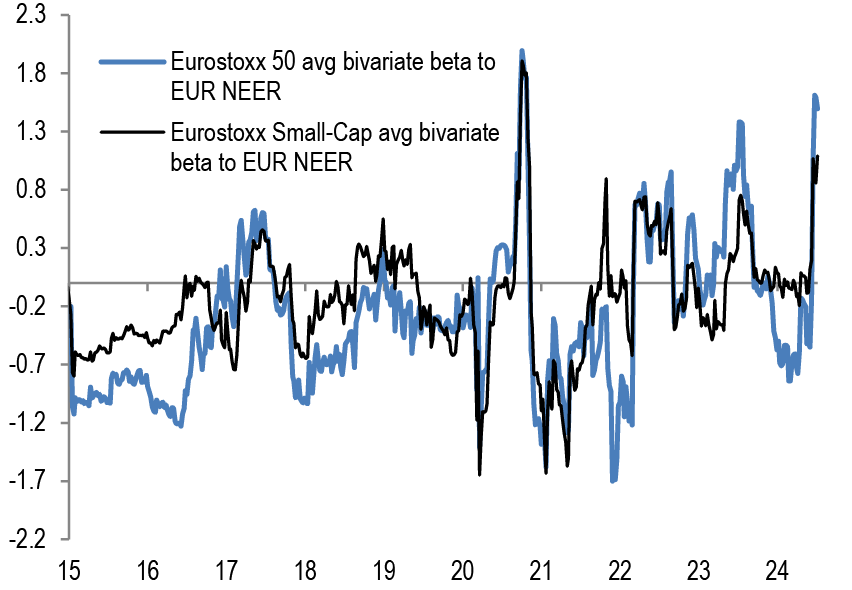
Chart A47: Average beta of Eurostoxx 50 companies and Eurostoxx Small-Cap to trade-weighted EUR
Rolling 26 weeks average betas based on a bivariate regression of the weekly returns of individual stocks in the Eurostoxx 50 index to the weekly returns of the MSCI AC World and JPM EUR Nominal broad effective exchange rate (NEER).
Source: Bloomberg Finance L.P., J.P. Morgan
Chart A48: Average beta of S&P500 companies to trade-weighted US dollar
Rolling 26 weeks average betas based on a bivariate regression of the weekly returns of stocks in the S&P500 index to the weekly returns of the MSCI AC World and JPM USD Nominal broad effective exchange rate(NEER).

Source: Bloomberg Finance L.P., J.P. Morgan
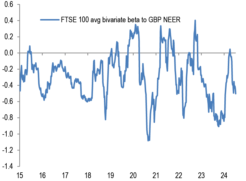
Chart A49: Average beta of FTSE 100 companies to trade-weighted GBP
Rolling 26 weeks average betas based on a bivariate regression of the weekly returns of individual stocks in the FTSE 100 index to the weekly returns of the MSCI AC World and JPM GBP Nominal broad effective exchange rate (NEER).
Source: Bloomberg Finance L.P., J.P. Morgan
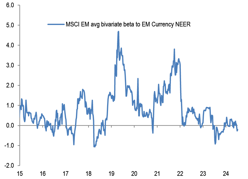
Chart A50: Average beta of MSCI EM companies to trade-weighted EM Currency Index
Rolling 26 weeks average betas based on a bivariate regression of the weekly returns of individual stocks in the MSCI EM index to the weekly returns of the MSCI AC World and JPM EM Nominal broad effective exchange rate (NEER).
Source: Bloomberg Finance L.P., J.P. Morgan
Non-Bank investors’ implied allocations
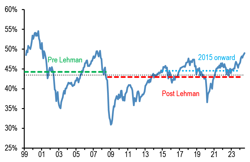
Chart A51: Implied equity allocation by non-bank investors globally
Global equities as % total holdings of equities/bonds/M2 by non-bank investors. Dotted lines are averages.
Source: Bloomberg Finance L.P., J.P. Morgan
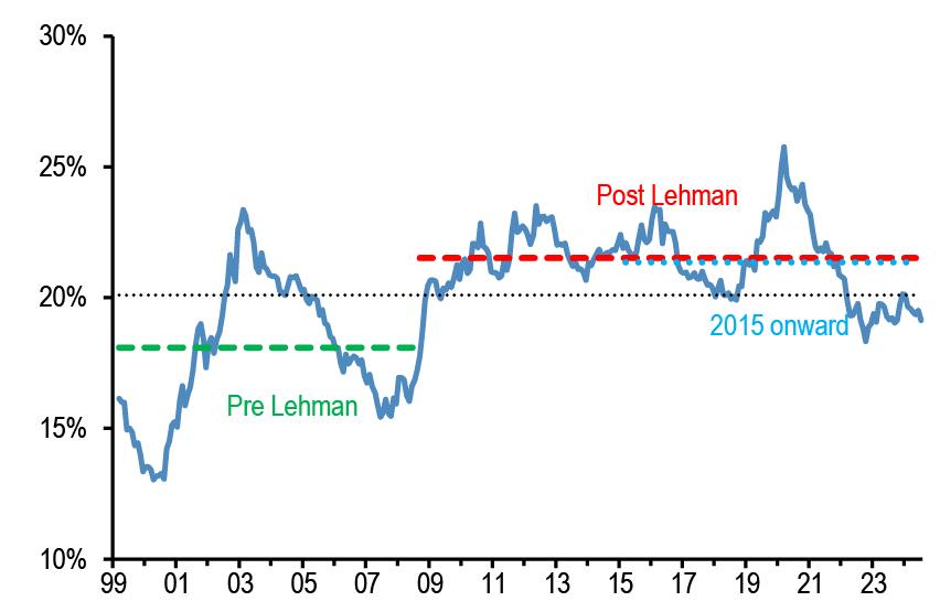
Chart A52: Implied bond allocation by non-bank investors globally
Global bonds as % total holdings of equities/bonds/M2 by non-bank investors. Dotted lines are averages.
Source: Bloomberg Finance L.P., J.P. Morgan
Chart A53: Implied cash allocation by non-bank investors globally
Global cash held by non-bank investors as % total holdings of equities/bonds/M2 by non-bank investors. Dotted lines are averages.

Source: Bloomberg Finance L.P., J.P. Morgan
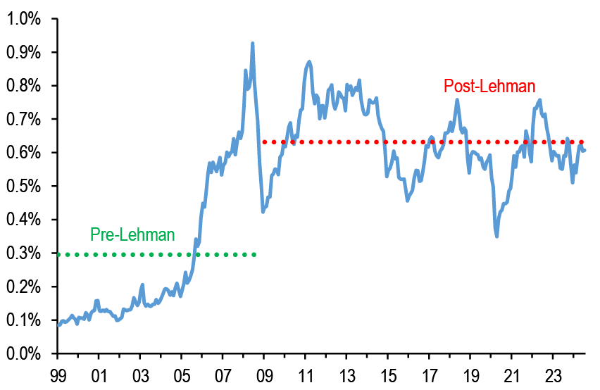
Chart A54: Implied commodity allocation by non-bank investors globally
Proxied by the open interest of commodity futures ex gold as % of the stock of equities, bonds and cash held by non-bank investors globally.
Source: Bloomberg Finance L.P., J.P. Morgan
